
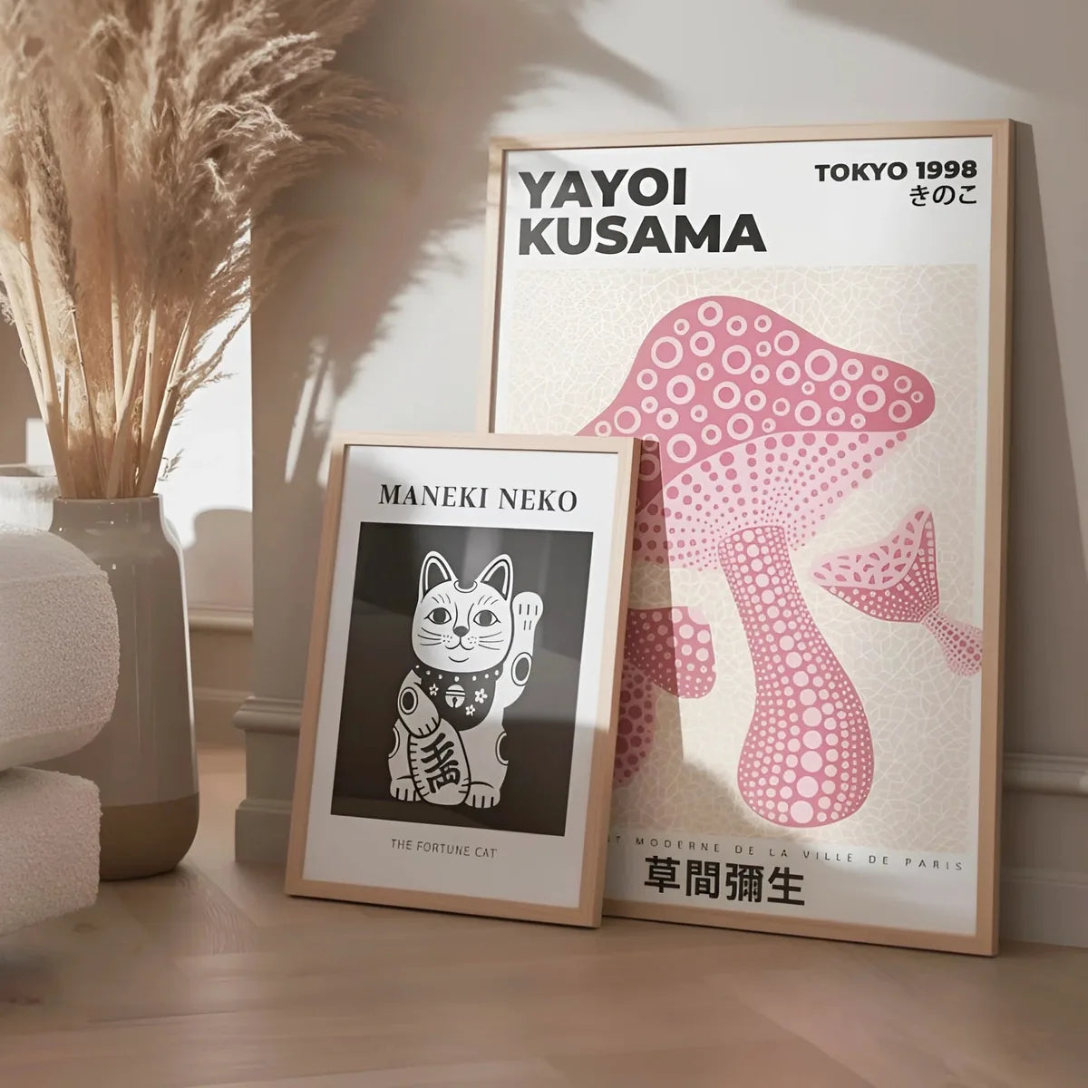
Yayoi Kusama, the polka-dot universe
From Matsumoto to Tokyo, via ten years in New York, Yayoi Kusama turned dots and yellow pumpkins into two planetary signatures. A curator note on a body of work that can live on your wall.
Poster history and practical decoration guides.

From Matsumoto to Tokyo, via ten years in New York, Yayoi Kusama turned dots and yellow pumpkins into two planetary signatures. A curator note on a body of work that can live on your wall.

A century after it opened in Weimar, the Bauhaus school still feeds global graphic design. Why its posters age well, and how to pair them with vintage travel pieces.

Pairing living plants with botanical posters, room by room. Choosing motifs, balancing greens, hanging at the right height: a simple method for a home that breathes.

A line of horizon, depth, calm. How to choose a landscape, where to hang it above a sofa or bed, and when to prefer a warm horizon over a cool one.

Cassandre, Broders, Loupot and Roger Soubie: twenty years that shaped our image of modern travel. A survey of a period that has returned to the auction rooms.

From the 1925 Exposition to the skyscrapers of New York, Art Deco dressed a world in full acceleration. Origins, principles, and why it never truly disappeared.

One large piece or a pair, a calm wall for a busy motif, the right frame: how to live with an abstract poster without crowding the room.

The Belle Epoque and Art Deco look of tennis, brought home. Court-green and ochre palettes, oak frames, and the rooms where a court poster belongs.

From the Florentine Negroni to the Parisian Boulevardier, the classic cocktail has found its graphic language in watercolor and lithography. A curator note on a genre the kitchen wall keeps asking for.

Founded in 1919 in Weimar, the Bauhaus school lasted fourteen years and shaped fifty years of world design. Portrait of a utopia that held together.

The Art Deco swing, the green and warm woods make for a hushed kind of decor. Where to hang a golf poster, how to pair it with leather and oak, room by room.

The scientific botanical plates of the 18th century have become one of the most sought-after decorative motifs. A look back at two centuries of a discreet and resilient genre.

The graphic heritage of the Tour de France set on a wall. Dynamic lines, jersey yellow and midnight blue, and the rooms that love that motion: garage, office, hallway.

From American folk botanicals to eighteenth-century scientific plates, flowers have infused the twentieth-century poster. A curator note on a genre that shifts the light of a room without painting the walls.

Cote d'Azur, Alps, Brittany: France's railway companies produced between 1900 and 1950 the finest tourist posters ever made. A story of competition that raised the bar.

Basketball, football, boxing: team-sport posters wake up a teen room, a home gym or an office. Large formats, dynamic placement, color blocking, how to do it.

30x40, 50x70 or 70x100: the right size depends on the wall, the furniture, and the reading distance. Three simple rules, and a few concrete examples.

Composing a gallery of destinations without slipping into postcard territory. Color harmony, choosing your stops, and where to hang it: living room, hallway, office.

Three woods, three uses. A practical guide to picking the right frame, understanding what the mat board does, and knowing when to leave a poster frameless.

Minimalist, warm, vintage or graphic: each living room style calls for a different poster selection. Four profiles, four approaches.

Blue and white, vintage resort graphics, warm wood: the winter-sports poster brings mountain air into the city. Palette, hanging and materials for a chalet interior.

The kitchen is the room where you spend the most time on your feet. The posters that hang there follow different rules from the living room. What works, and why.

Geometry, gold accents, symmetry: the graphic spirit of the 1920s and 1930s applied to the dining room and the entryway, with black frames.

Since 1980, each edition of the tournament has had its own poster, signed by a different artist. An overview of a public commission that brought contemporary art and clay courts into dialogue.

The bedroom is the most personal space. The posters you hang there need to last - above the bed or beside it. What creates a lasting presence, and what grows tiresome quickly.

Clean lines, facades, vanishing points. How architecture posters give a graphic interior its structure, from the office to the hallway, and why a black or thin frame suits them so well.

Tenants, stone walls, protected surfaces: several solutions allow you to hang framed posters without drilling, for loads from 1 to 5 kilograms.

Dots, infinity motifs, bold color: composing an assertive wall inspired by the world of Yayoi Kusama, and pairing it with a pared-back interior.

Between 1925 and 1935, a handful of Parisian poster artists invented the graphic language of modern travel. Cassandre, Broders, Loupot, Carlu: the story of a decade that still shapes the way we see.

The mid-century modern style has been everywhere for fifteen years. What it really is, where it comes from, and which posters suit it without falling into caricature.

From the naive animal to the realistic one, in a soft palette. How to move an animal poster from the living room to a child’s room without tipping into the twee.

Edo, 1831. A 71-year-old painter cuts a wave that will cross Europe and change Van Gogh, Monet, Toulouse-Lautrec. A curator note on Hokusai and the grammar he left behind.

Before sports photography, illustration ruled the sporting poster. An aesthetic of gesture and speed that still works in any interior.

Three posters that have nothing to say to each other make a messy wall. Three posters that share a single colour thread make a composition. The method in practice.

A face hung in the right place changes the mood of a room. Eye-level placement, single piece or pair, warm light, the right frame: how to live with a portrait rather than endure it.

From Hokusai's Edo to Yayoi Kusama's dots, Japanese graphic art has influenced Europe in successive waves. The story of a circulation of images that never stopped.

The home office is the room where posters have the greatest effect on daily life. What inspires, what helps you focus, and what distracts too much.

Double bass, trumpet, the spirit of vinyl: music posters bring rhythm and bold color. Living-room corner, studio or bar nook, how to build a wall that swings.

Montmartre, 1891. A 27-year-old painter, son of a Norman aristocrat, signs a lithograph for the Moulin Rouge that changes the street. A curator note on Toulouse-Lautrec and the gesture that invented the poster.

The hallway is the first and last room you see. One well-placed poster is enough. How to choose and where to hang for a lasting effect.

Black and white plays on depth and contrast. Minimalist interiors, a thin black frame and a wide mat, hallway or bedroom: how to give it full space without overloading it.

The Eiffel Tower is the most represented object in the history of the world poster. Why some representations endure and others are forgotten, and how to choose a Paris poster that is not a souvenir.

Paris, December 1894. A 34-year-old Czech accepts in two days a commission no one else wants, signs a poster for Sarah Bernhardt, and invents Art Nouveau with a single stroke.

At 77, bedridden after an operation, Matisse invents a new technique to keep painting. Seven final years of work that change the entire graphic design of the 20th century.

Oak in the kitchen, black in the study, white in the bedroom: the rules are not absolute, but they have a logic. A practical room-by-room explanation.

From Absinthe Robette to the Campari campaigns of the 1960s, alcohol funded some of the finest posters of the 20th century. A look back at a genre that blends art and commerce.

Amersfoort 1872, New York 1944. Between those two cities, Piet Mondrian drops trees, windmills and chrysanthemums for three colors and two lines. A curator note on a discipline that redefined the wall.

Three compositions that always work, two pitfalls to avoid, a few tools. Everything you need to hang a poster wall without regrets.

Hokusai, Hiroshige, Utamaro: three names, three aesthetics, three ways into the world of the Japanese woodblock print. A guide for choosing, understanding and hanging.

A poster for a child's bedroom must last at least five years. How to choose images that grow with the child, without falling into kitsch or the overly babyish.

Moscow, 1923. In a freezing studio at the Glavpolitprosvet, a 32-year-old painter assembles cut-out photographs into diagonal compositions. A curator note on Alexander Rodchenko, El Lissitzky and a revolutionary graphic language.

Three woods, three uses. A quick guide to making the right choice, with the technical reasons behind each one.

The japandi style blends Japanese minimalism with Scandinavian hygge. A precise visual vocabulary, posters that fit naturally, and how to live with it without copying it.

New York, 1962. In two studios a few streets apart, Andy Warhol paints Campbell's Soup cans and Roy Lichtenstein blows up a comic-strip panel. Pop art is born in a few months.

Milan, December 1980. Ettore Sottsass, 63, gathers seven young designers at home and declares war on good taste. The Memphis Group will last seven years, briefly, intensely.

From Casablanca to Sunset Boulevard, how the great MGM, Paramount and Warner studios invented a visual language that survived photography, television and the digital era.

Vienna, May 1903. Three men, the architect Josef Hoffmann, the designer Koloman Moser and the industrialist Fritz Wärndorfer, found a workshop that wants to turn every object into a total work of art.

How a New York photographer and a graphic designer defined, between 1956 and 1967, the visual language of an entire genre. Blue Note covers have become posters that kitchens and living rooms ask for.

Vienna, 1907. Gustav Klimt finishes "The Kiss". For three years, the painter has worked in gold leaf on a canvas of 1.80 square meters. A curator note on the most recognizable period of European Symbolism.

From Mercator in 1569 to Ortelius in 1570, how Europe drew the world, and why those world maps still inhabit the wall of the living room, the office, and the child's bedroom.

Verdun, 1916. A 35-year-old Normandy painter, mobilized in the engineers, sketches at the front the dismantled pieces of a 75-millimeter cannon. From it will come a mechanical vocabulary that will structure his entire body of work.

From the Eiffel Tower to the Galerie des machines, how the World's Fairs produced some of the most beautiful posters of the late nineteenth century. A short survey of an almost forgotten genre.

From William Curtis's Botanical Magazine (1787) to the roses of Pierre-Joseph Redouté, how the art of the scientific plate crossed two centuries before returning to inhabit the living-room wall.

From Johannes Hevelius to John Flamsteed, how the celestial atlases of the seventeenth century turned the starry vault into a lasting decorative image. A short walk among framed constellations.

Between 1880 and 1900, Parisian theater and the Montmartre cabarets commission posters that found the modern poster. Three names cover the graphic revolution: Chéret, Steinlen, Toulouse-Lautrec.

How the Parisian café-concert and the great hall of the Folies Bergère made Jules Chéret the father of the modern poster, and why his language still works on contemporary walls.

Botanicals, cocktails, coffee: themes that hold up in a kitchen, where to place frames between hood and counter, and how to protect paper from cooking steam.

From the Mille Miglia to the Tour de France, how the sports poster documented forty years of motor and bicycle racing, and why the gesture is returning to the wall.

Above the sideboard or as a gallery wall on the accent wall: the two compositions that work in a dining room, and how to choose between them.

From Leonetto Cappiello to the great Italian and French commercial poster tradition, how coffee became, between 1900 and 1930, a major subject of modern graphic design.

The staircase is the most underused open wall in a home. Spacing, progressive sizing, hang line: how to compose a gallery wall that follows the climb without cheating.

An Art Deco poster next to a contemporary abstract: how to keep them from clashing. Shared palette, coherent framing, visual hierarchy.

A single large piece or several smaller ones: the decision depends on the room size, viewing distance, and visual balance. The guide to settle it.

Adhesive strips, washi tape, picture shelves, no-drill supports: the full arsenal to hang without damage, and the list of what to avoid at all costs.

Wall-to-poster ratio, viewing distance, 30x40 / 50x70 / 70x100 formats: three proportion rules that work everywhere, from hallway to double living room.

Picture light, warm or neutral LED, lighting distance: three technical decisions to reveal a poster without fading it. With the color temperatures to aim for.

A poster on art paper, well framed, crosses a hundred years. Badly protected, it yellows in five. The complete guide to ensuring the longevity of a work on paper.

Japanese-paper lining, professional retouching, dry cleaning: techniques that work, those that must absolutely be left to a professional, and impact on value.