The serve, arm stretched to the sky, ball held still for a fraction of a second. That is the image the poster artists of the 1920s fixed to sell Riviera tournaments and the clubs of the capital. Tennis here is less a sport than a form of elegance: white flannel trousers, an ash-wood racket, a burnt-ochre ground. This century-old look transfers remarkably well to a wall today.
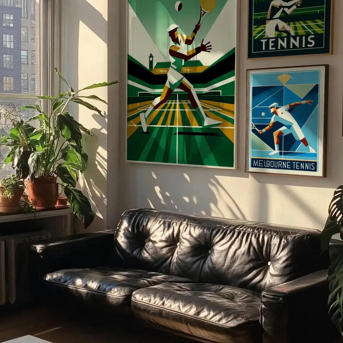
A tennis poster works because it combines two things the eye loves: a clean silhouette, readable from across the room, and a warm palette inherited from old lithography. Court green, ochre, off-white, sometimes a midnight blue. These are muted colors, never loud, that settle into a room without dominating it. What remains is knowing where to hang it, and in what frame.
The club spirit, without the tie
A tennis poster calls for a slightly dressed-up setting, though never stiff. Think of an old club locker room: woodwork, worn leather, wool. A tan leather club armchair, a bookcase, a green-shaded lamp, and above it a player caught mid-backhand. The trick is to stay within a narrow range: two or three colors picked up around the room, and the poster becomes the anchor for the eye rather than one more thing on the wall. On a light wall, a single large format is enough; on a dark wall, a wide frame and a cream mat give the image room to breathe.
Room by room
- Entryway: a large-format serve, the first image you meet on coming home.
- Office: a diptych of players in motion, giving rhythm above a writing desk.
- Living room: one strong piece above the sofa, its ochre and green echoed in a cushion.
- Hallway: three small formats in a row, like a frieze of gestures, from serve to smash.
The right frame for the right court
Oak is the king of woods for tennis. Its honeyed tone extends the ochre of the old posters and recalls vintage wooden rackets. Choose it pale for a summery mood, darker, almost tobacco, for an English-club feel. Black stays a clean option if the poster plays on contrast, a dark player on a light ground. As for height, center the image around 1.55 meters off the floor, at the eye level of a standing person. Above a sofa or a console, leave some twenty centimeters between the furniture and the bottom of the frame, so the poster can breathe.
A tennis poster does not tell the story of a match. It freezes a gesture, and that suspended gesture is enough to give movement to a still wall.
At Montmartre Poster, the tennis collection brings together Art Deco serves, cubist players and clay courts, printed on 275 gsm art paper. Enough to compose a sporting, refined corner, where the color stays muted and the gesture stays alive.