The bedroom is the room where you spend the most time looking at the walls, eyes half-closed, in a state between waking and sleep. It is different from the living room, where a poster is seen head-on, while moving, during activities. In the bedroom, it is seen lying down, at an angle, in often gentle light. These conditions change what works.
Very dynamic posters grow tiresome quickly in a bedroom. A high-contrast graphic, an agitated composition, clashing colours: these are assets in a hallway or a workspace, not in a bedroom where you are trying to rest. What works here is the opposite: calming compositions, soft or monochrome palettes, subjects that do not call for action.
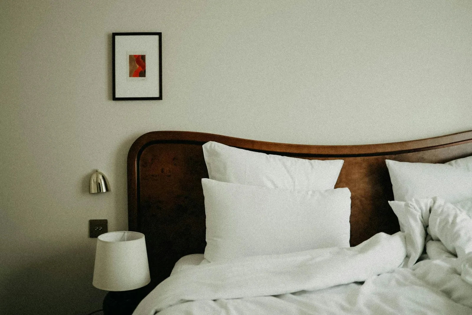
Above the bed: the main piece
Above the bed, the poster must be both present (it is seen when entering the room, it sets the tone) and restful (it can be looked at without fatigue). Formats that work: a 70x100 centred if the bed is 160 cm wide or more, a 50x70 centred if the bed is 140 cm. The proportion rule applies: the poster should cover between 60 and 75 % of the width of the bed or headboard.
Subjects that work above the bed: soft abstract compositions (a Matisse blue, a japonesque ochre), botanical plates on white ground (elegant, neutral), simplified landscape posters (calm sea, serene mountain, autumn forest). What works less well: very graphic compositions, expressive portraits (a direct gaze facing the bed can feel uncomfortable over time), sporting or dynamic subjects.
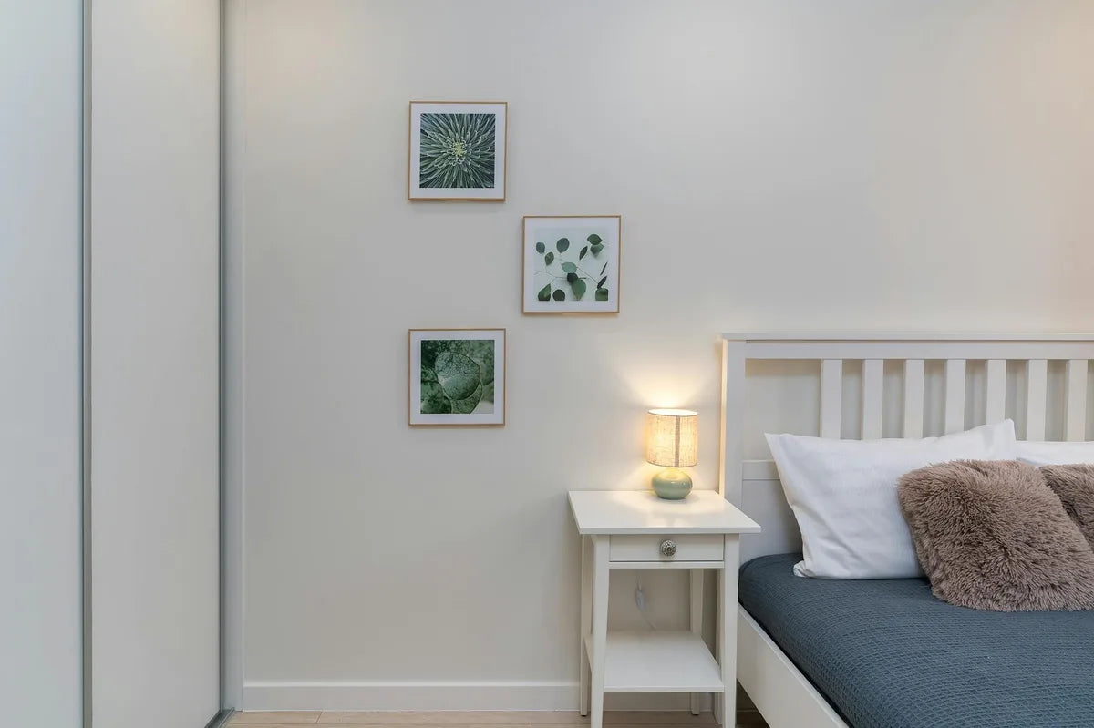
The bedside: an intimate format
At the bedside, a 30x40 is perfect. It is seen up close, in the light of the bedside lamp, during moments of reading or half-sleep. One subject, simple, well composed. A botanical plate of a single plant, a Japanese motif illustration, a restrained typographic piece. The bedside is not the place for a gallery wall.
The bedroom is the space where a poster is looked at the longest. Choose an image you will not tire of in three months.
Colours and materials
In the bedroom, soft palettes last better than saturated ones. A poster in pale blue, sage green, dusty pink or cream white will harmonise with most bedding and bedroom wall paint. Very colourful posters (vivid red, intense yellow, orange) can work if the rest of the room is very plain, but they are risky: an intense colour facing the bed, seen every morning on waking, can become tiring.
On frames: natural oak is very often the right choice in a bedroom. It is warm, undramatic, and harmonises with wooden furniture and natural textiles. Black works well if the room already has other black elements (bed frame, light fitting). White disappears into white walls, it creates no visual anchor - which is sometimes exactly what you want.