The word japandi is a contraction of Japanese and Scandinavian. It describes an interior style that crystallised in the mid-2010s in decorating magazines and on Instagram, but whose roots go much further back. On one side, Japanese wabi-sabi: the aesthetics of imperfection, of the natural, of what ages well. On the other, Danish hygge: the warmth of home, soft materials, candlelight. Two philosophies of comfort that share more than they oppose.
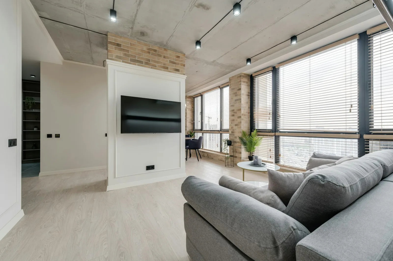
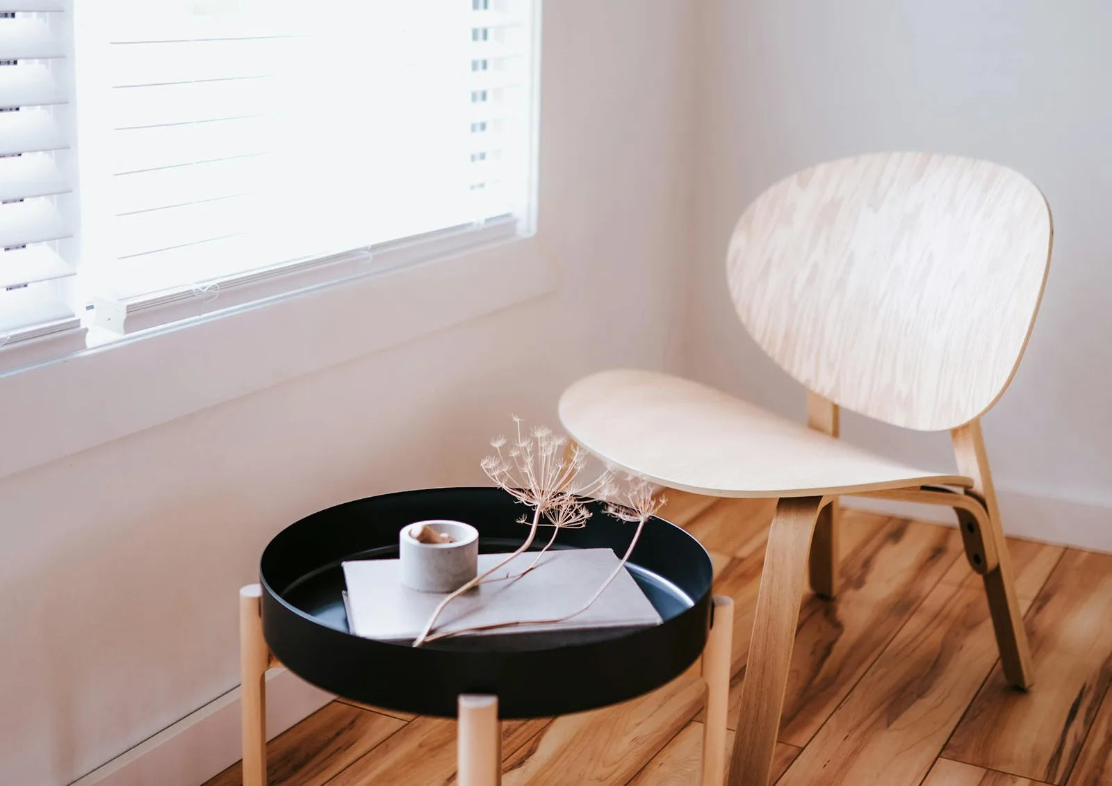
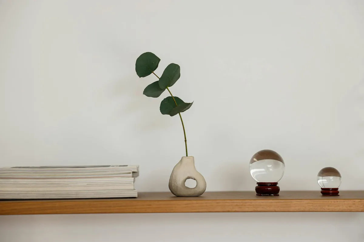
What japandi has popularised in decoration is specific: pale wood furniture (oak, beech, ash), linen or heavy cotton textiles, a neutral palette (off-white, beige, sage green, slate grey), simple houseplants (pothos, ficus lyrata, monstera), handmade ceramics. A japandi space is never empty: it is edited. Every object is there intentionally.
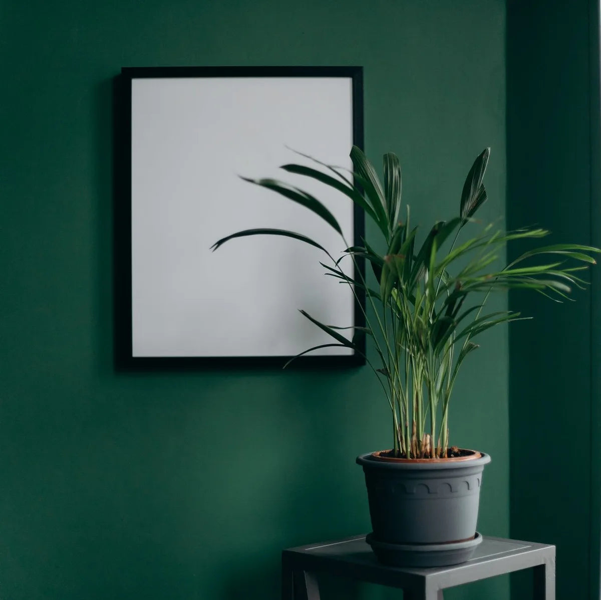
What works as a poster in a japandi interior
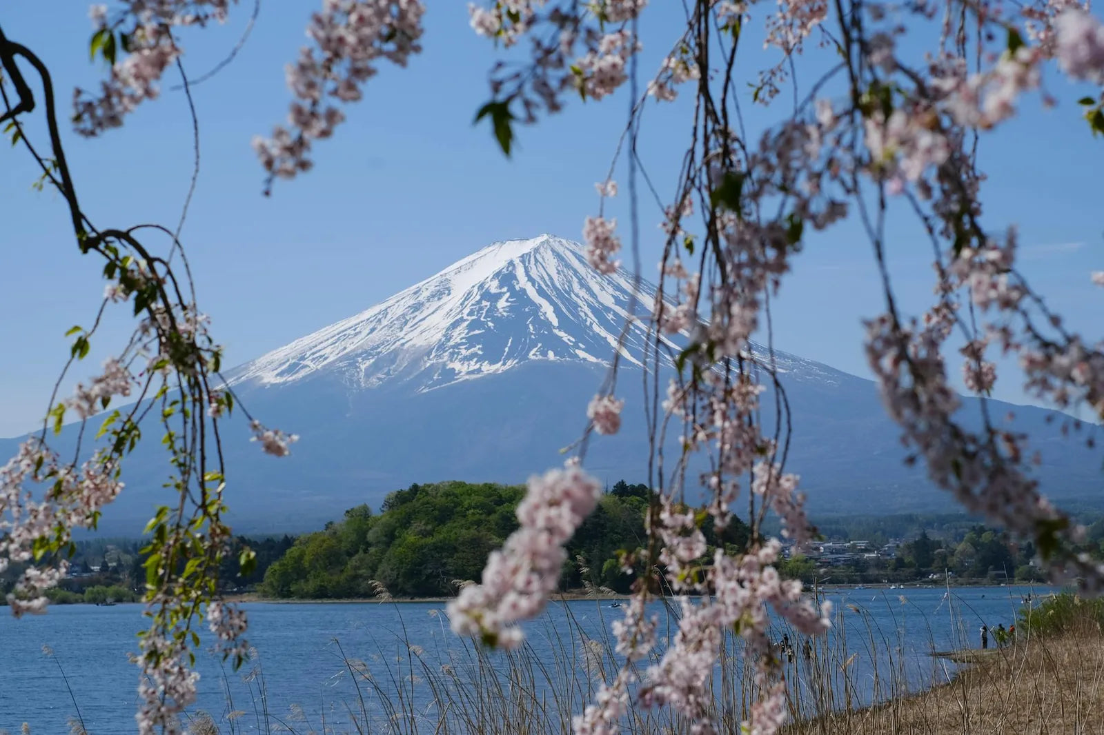
Japanese woodblock prints are the most obvious choice. A Hokusai or Hiroshige sheet in a natural oak frame without too thick a mount: it is the perfect alignment between subject and the style of the room. The print is Japanese, the frame is pale wood, the composition is airy. Nothing jars.
Botanical plates also work very well. Their white background, precise drawing, natural subject: everything matches the japandi vocabulary. An ikebana plate (the Japanese art of flower arranging), a houseplant illustration, a herbarium of simple leaves. These images do not demand attention - they accompany.
What does not work
Posters that are too colourful or too graphic clash with the japandi aesthetic. A primary Bauhaus poster (red, blue, yellow) in a japandi living room creates a strong dissonance: Bauhaus is urban, industrial, assertive - everything japandi is not. Same goes for sports posters or dramatic typography: too much energy for a space that seeks very little.
Gold or silver frames are to be avoided. Japandi has no shiny metal in its vocabulary. Wood, ceramics, linen, cotton: organic, matte materials that absorb light rather than reflect it. A gleaming brass frame in a japandi interior would be like a spelling mistake in a carefully written letter.
Japanese wabi-sabi values the beauty of incompleteness and the transient. A slightly aged poster, a frame whose wood has developed a patina: in a committed japandi interior, that is a quality, not a flaw.
Composition in a japandi interior
In a japandi interior, the rule of less is more applies rigorously. One large poster on an entire wall is worth more than three small ones. If you want several posters, space them further apart than you would in a classic living room: the air between pieces is an integral part of the composition. A very tight gallery wall is the opposite of japandi.
Japandi formats
Portrait format is more japandi than landscape. Japanese woodblock prints are almost all vertical (the nagaban or chuban format). Botanical plates are often vertical. A 50x70 in portrait, in an oak frame, against an ivory wall with a plant in the corner: that is the canonical japandi composition.
If you want several posters, go for two identical portrait formats, separated by 30 centimetres, centred on the same horizontal axis. Quiet symmetry is very much at home in japandi: it does not aspire to dynamism - it seeks balance.