A hallway wall, six posters framed in pale wood. Rome, the Riviera, London, the Caribbean, Japan, Australia. Every morning you walk past, and every morning it is a small takeoff. The vintage travel poster has a power few images possess: it does not merely decorate, it opens a window. The shipping and railway companies understood this as early as the 1920s, commissioning illustrators to draw destinations no one had yet seen, but already dreamed of.
The trap, precisely, is the postcard. Lining up six places with no logic gives you a wall of tourist souvenirs, not a gallery. What turns a collection of posters into a composition is harmony, not diversity. A travel poster that works indoors comes down to three decisions: which colors dominate, which destinations talk to each other, and at what height you hang them.
Harmony before destination
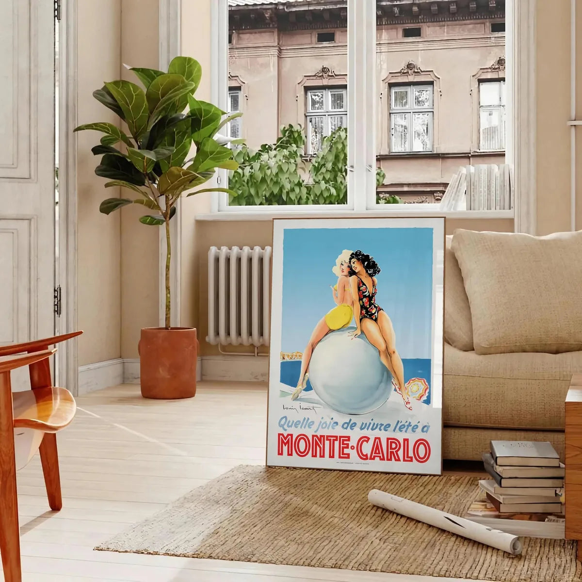
The natural reflex is to choose posters by the places you love. Better to start with color. A coherent wall brings together posters that share a dominant tone: the blues and turquoises of seaside destinations, or the ochres and terracottas of southern cities. You can mix eras and styles, Art Deco and 1950s illustration, as long as the palette holds together. A single poster can play on contrast, a splash of red in a blue ensemble, provided it is isolated and intentional. The rest follows the same family of tones.
What to hang where
- Living room: a single large poster above the sofa, or a row of three telling one journey.
- Hallway: the ideal gallery, six to eight medium formats in a staggered grid or a strict line, depending on the width.
- Office: a single faraway destination facing you, like a promise of the next stop.
- Bedroom: a seaside poster in calm blues, opposite the bed, to fall asleep by the water.
Frames, alignment, and the 1.55 m rule
For a travel gallery, the unity of the frames matters more than their richness. The same wood on every poster, pale oak for warm palettes, slim black for marine blues, gives the wall its coherence, even if the destinations have nothing in common. To align a gallery, think in terms of a median line: aim for a central axis 1.55 meters off the floor, and spread the frames on either side, keeping a regular gap of 5 to 7 centimeters between them. In a narrow hallway, prefer a single straight line to a staggered grid that would look messy.
A travel poster does not show a real place. It shows the idea you had of it before going. That is why it always makes you dream, even when you know the destination.
At Montmartre Poster, the vintage travel collection gathers railway lines, seaside stops and golden-age air posters, printed on 275 gsm art paper. Enough to compose a wall that makes you want to leave, and that holds together even when you stay home.