The "language of flowers" is a Victorian invention, codified around 1820, then spread by dozens of etiquette manuals in London and Paris. Pale rose said youth, peony said shame, forget-me-not said loyalty. The system was precise, sometimes absurd, and it shaped floral composition in painting, in still life, and later in advertising posters. A hundred and fifty years on, that coded language no longer operates in everyday reading. Nobody now decodes a bouquet as a moral message. But something of it remains: a flower in a graphic composition still places a feeling, a season, a memory.
That permanence explains why the botanical poster holds so well in contemporary decor. It does not need to be explained. A plate by Mary Delany, the English artist who invented precise botanical collage at the age of 72 in 1772, speaks to a child's eye as much as a horticulturist's. The poppies, irises and nasturtiums she cut by hand from colored paper, on a black ground, are kept at the British Museum in London. A thousand plates in ten years. It is one of the earliest expressions of what we now call "folk botanical": an authored, sentimental botany that values gesture over scientific accuracy.
Folk botanical and scientific plate: two registers
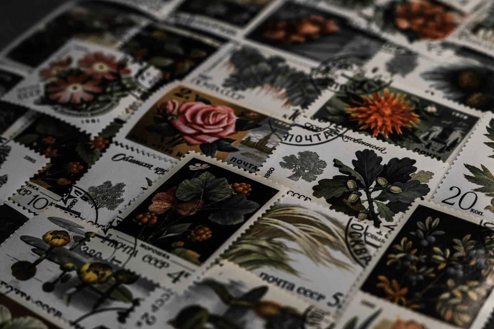
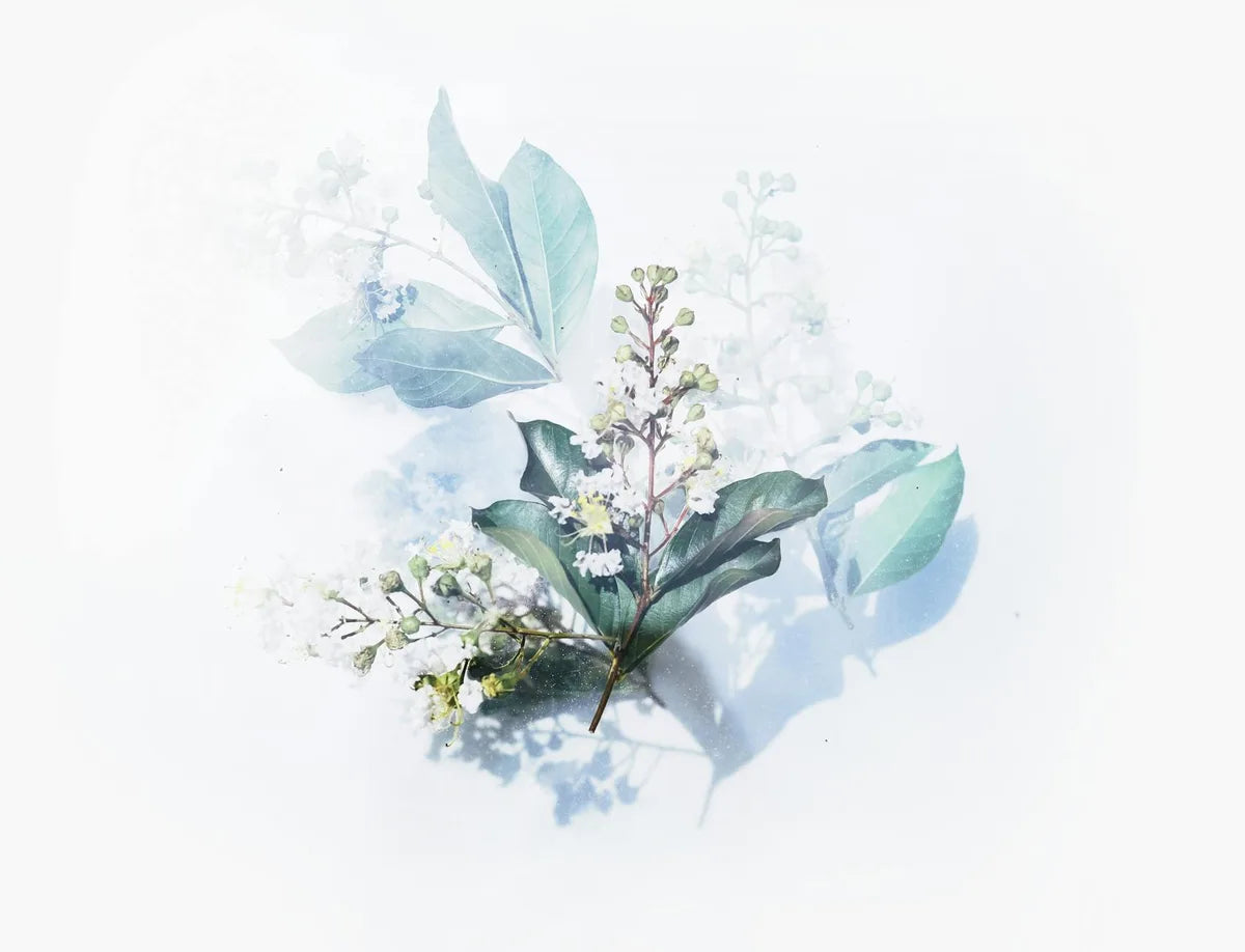
Two families have to be distinguished in the botanical genre. The scientific plate, inherited from Linnaeus in 1753 and from Redouté at the end of the eighteenth century, is precise, measurable, identifiable. White ground, fine line, accurate color, magnification of the reproductive organ in the margin. It is a classification tool that became a collector's piece. Folk botanical, freer and more sentimental, does not try to identify the species with precision. It tries to say a mood. Henri Rousseau, the Parisian douanier, paints in 1910 "The Dream", an imaginary jungle where leaves are painted one by one without correspondence to any real tropical flora. The work is a summit of folk botanical.
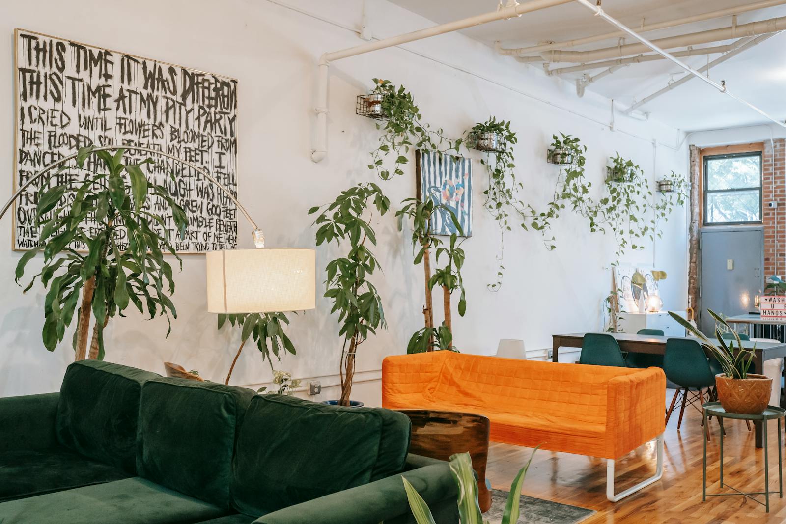
The two registers coexist on our walls and do not serve the same role. A Redouté scientific plate in a study, vertical format, fine oak or cream frame: the piece relies on the beauty of precision. A folk botanical above a low sofa, cream ground, flowers treated as emblems more than as specimens: the piece breathes, shifts mood, sets a note of warmth a scientific plate, more austere, would not give. Our "Find me in the garden" poster belongs to that second family. The bouquet is free, the palette is tender, the title acts as a lyrical signature more than a botanical caption.
Why a folk floral shifts the mood of a room
An empty room has the light of an empty room: neutral, functional, expectant. A room with a living bouquet has a spring light, even in November, because the eye rebuilds around the flowers a memory of warm season. A botanical poster works on the same mechanism, more stable. It does not wilt, it asks for no water, and it keeps broadcasting that seasonal signal year round. What perception psychology calls "chromatic recall": a color seen in a known context (the yellow of nasturtiums, the soft green of stems) fires the affective associations tied to that context. The brain does not distinguish a real flower from a painted one in terms of emotional memory.
Mary Delany began cutting flowers from colored paper at 72, in 1772. She produced close to a thousand plates in ten years, now kept at the British Museum.
That is why folk botanical works particularly well in rooms short on daylight (a north bedroom, an interior hallway, a dining area without direct window). A floral poster in a yellow or orange key, seen every morning, creates the sensation of an extra window. Our Farmers Market New York cactus poster plays that register, transposing botany toward the imagery of a neighborhood market: pots of cacti lined up on a New York sidewalk, tender palette, handwritten labels visible. It is a botany of urban memory more than of the garden, and it works very well in a kitchen or a reading corner.
Mixing botanical and vintage travel
Can a folk botanical poster be mixed with a vintage travel poster from 1925-1935? Yes, on two conditions. First, share a palette. If your folk botanical sits in straw yellows and tender greens, pick a travel poster that contains at least one of those tones. A Côte d'Azur poster by Broders, where the parasol pines cut against a yellow sky, echoes a floral plate in the same warmth. Second, differentiate the formats. Vintage travel usually takes a larger format (50 by 70 or 70 by 100), the botanical stays at 30 by 40 or 40 by 50. The size contrast prevents rivalry.
The frame unifies the whole. Light oak throughout, or matte black throughout: frame consistency lets the eye read the composition as a single piece. Mixing frames (one oak, one black, one metal) breaks the harmony, even if each piece is beautiful taken alone.
Three starting points
- A folk floral alone above a sofa, 50 by 70 format, light oak frame. The great classic that holds in most contemporary living rooms.
- A scientific plate of a single flower (poppy, iris, nasturtium), 30 by 40 format, cream or off-white frame. To hang in a study or a reading corner.
- A botanical triptych (three 30 by 40 in a line), plates of different flowers in the same palette. Very effective in an entryway or a hallway.
At Montmartre Poster, the botanical collection brings together folk florals, scientific plates, cacti and contemporary herbaria. The works are printed on 275 gsm art paper, which keeps the fineness of the line without saturating the greens or hardening the yellows. The selection favors pieces that hold in a room over the long run, more than seasonal showpieces.