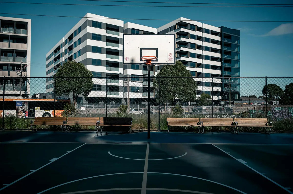
A wheel, a back bent over the handlebars, and behind it, mountains reduced to three flat blocks of color. Since the 1920s, the cycling poster has gone straight to the point: speed. The illustrators of the Tour de France and the cycle makers understood early that a diagonal line, a leaning rider, an italic typeface were enough to convey movement. It is this drawn movement that you hang on the wall, and it works wonders in rooms that lack it.
Cycling has a palette of its own. Jersey yellow, midnight blue, brick red, the fir green of the mountain passes, and the off-white of old paper. Bold colors but never neon, which hold their place without saturating the room. Above all, the cycling poster has a rare asset: its composition runs on the diagonal. Where a still life is calm and centered, a poster of a rider pulls the eye from one corner to the other. Placed in the right spot, it energizes a whole wall.
Play the line, not the collection
The mistake would be to put them everywhere. A cycling poster is already loaded with movement; two or three are enough, and it is better to line them up than to stack them. In a hallway, a trio of riders facing the same way creates a sense of procession, as if the peloton were crossing the room. Above a workbench or a desk, a single large format sets the tone. The golden rule: let all the diagonals run in the same direction, otherwise the eye collides and the wall looks restless.
Room by room
- Garage or workshop: a race poster above the hung bike, object and image answering each other.
- Office: a large format of a leaning rider, suggesting effort without distracting from work.
- Hallway: a trio of cyclists lined up the same way, for a moving-peloton effect.
- Living room: a vintage Tour piece, its yellow and blue echoed in a throw or a cushion.
Slim frame, light wall, grazing light
Cycling does not like heavy frames. A slim profile, matte black or brushed aluminum, keeps the sporting spirit and lets the composition breathe. Pale oak also works for vintage posters with warm ochres. Avoid gold and moldings, too solemn for an outdoor subject. On the wall, white or a very pale gray shows off the bold cycling colors best. As for height, center at 1.55 meters off the floor; in a narrow hallway, a grazing light from a wall sconce brings out the grain of the paper and accentuates the depth of the composition.
A cycling poster does not show a finish. It shows the momentum, the instant just before. That is what makes it so effective on a wall: it always promises the next movement.
At Montmartre Poster, the cycling collection draws on the golden age of the sporting poster, from the Tour de France to cycle advertisements, printed on 275 gsm art paper. Enough to give speed to a calm wall, without changing a single piece of furniture.