The frame is not a neutral accessory. It shapes how the poster is read, it enters into dialogue with the room's furniture, and it integrates - or fails to - into the overall atmosphere. Choosing a frame is a style decision every bit as important as choosing the poster itself.
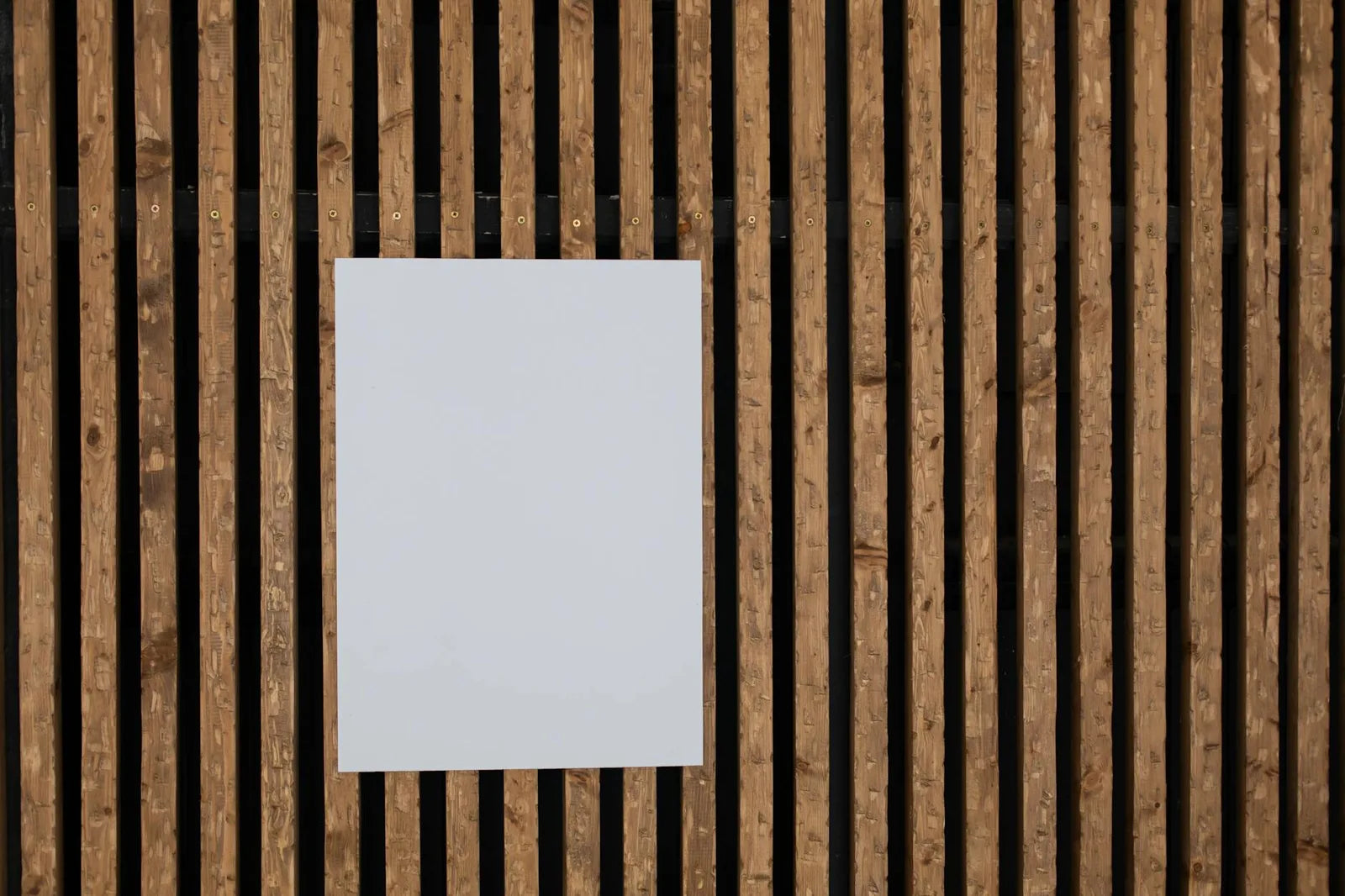
At Montmartre Poster we offer three finishes: natural oak, matte black, white. This list is not arbitrary. These are the three frames that suit 95% of contemporary interiors without ever going out of date or creating dissonance. For each room, one of the three almost always stands out naturally.
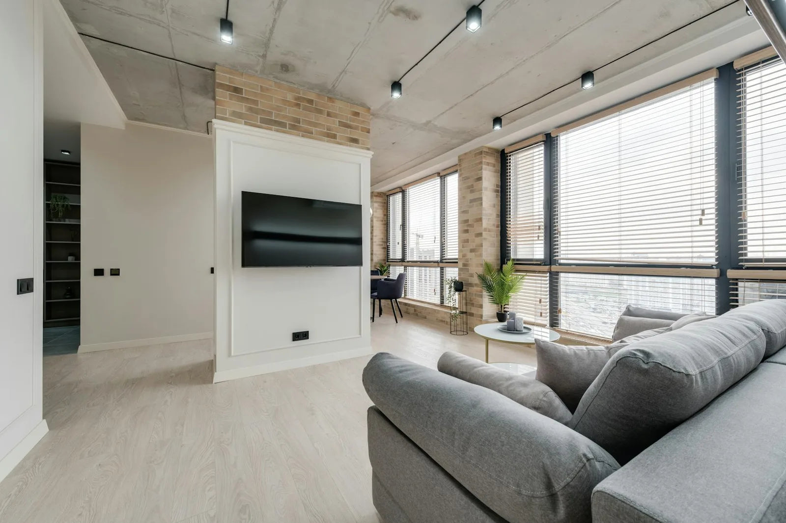
Living room: oak or black depending on the palette
In a living room with light tones (white or beige walls, pale flooring, grey or linen sofa), natural oak is the most harmonious choice. It brings warmth without introducing a strong contrast. It fits naturally into the vocabulary of light woods often found in this type of interior.
In a living room with contrasting tones (coloured wall, dark furniture, deep sofa), matte black asserts itself. It does not compete with the other dark elements; it structures the composition without adding a new colour. It is also the default choice for a gallery wall with several posters: it provides the visual unity that mixed frames cannot achieve.
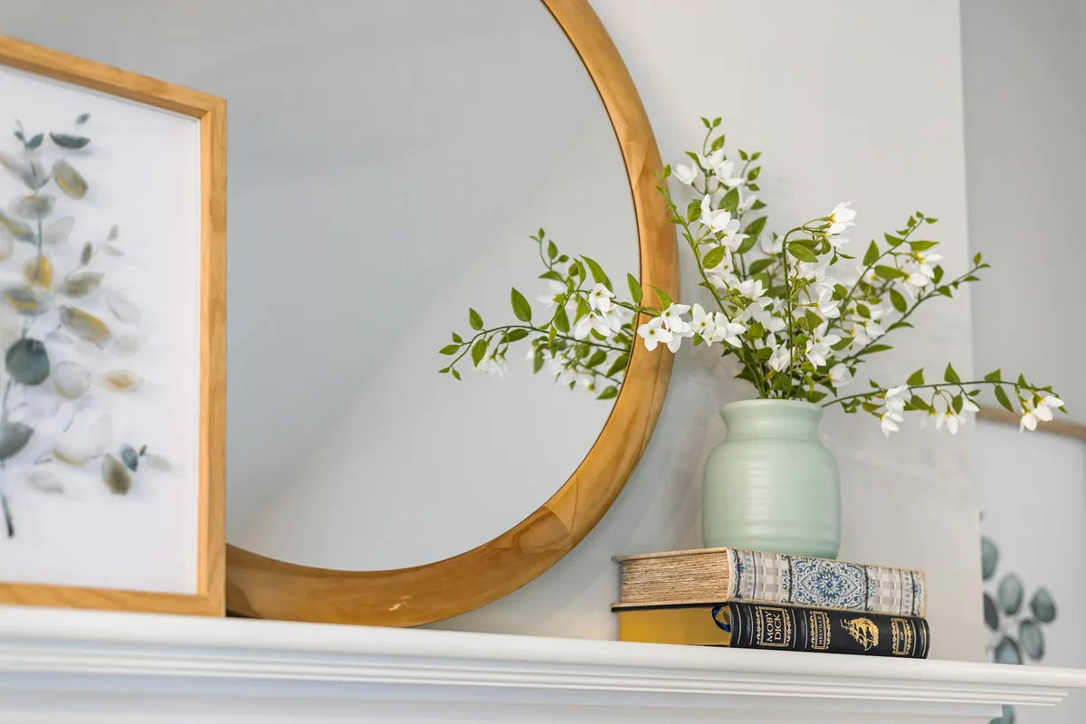
Bedroom: oak or white depending on the mood
In a bedroom the goal is calm. Natural oak is the most neutral of the two warm options: it does not dramatise the poster, it simply presents it. White is the ultra-minimalist choice: the frame disappears and only the image remains. Black can work in very structured bedrooms, but it introduces a subtle tension that some find stimulating in a space meant for rest.
Study: black or oak depending on working style
In a contemporary or industrial-style study (metal-and-wood desk, metal shelving, steel lighting), matte black is consistent. In a softer study (wooden bookshelves, reading chair, brass lamp), oak integrates better. Avoid white in a study unless the furniture is entirely white: white among varied colours tends to look inconsistent.
A black frame is a decision. An oak frame is an invitation. A white frame is an abstention. All three are valid, depending on what you want the poster to say.

Kitchen: oak almost always
In the kitchen, oak is almost always the right choice. It harmonises with the natural materials often present (wooden cupboards, stone worktops, plants) and warms a space that can easily feel cold (white tiles, stainless steel, appliances). Black can work in a very contemporary kitchen with black or anthracite lacquered units. White disappears in all-white kitchens, which is not necessarily a problem.
Hallway: the frame as a signal
The hallway is the first thing visitors see. The frame carries a stronger signal value there than anywhere else. An oak frame in a classic hallway says something about your taste (warm, natural, unpretentious). A black frame in a contemporary hallway says something else (precise, assertive, graphic). Choose in line with the overall style of the home.