The kitchen is the room you decorate last, often reluctantly. You assign it the posters you could not place elsewhere, or nothing at all, out of fear of splashes. That is a waste. A kitchen with no framed work always looks colder than it really is, and two or three well-chosen, well-placed posters are enough to turn the room into a living space. The job comes down to picking the right themes, the right spot, and a frame that handles steam.
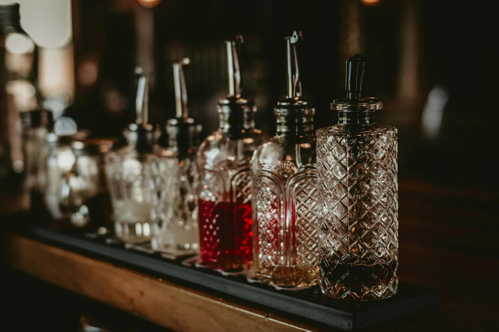
Three families of images work particularly well in a kitchen. Botanical plates of fruits, citrus and herbs, descended from the scientific plates of the eighteenth century, talk naturally with whatever is cooking on the stove. Vintage cocktail posters, in the spirit of the Parisian brasserie menus of the 1930s, lay down a bar and service mood. Coffee and roasting posters, more contemporary, hold up in a morning reading corner. To avoid: heavyweight museum pieces (Rothko, Mark, grand portraits) that feel out of register in a cooking space.
Where to hang: the kitchen map
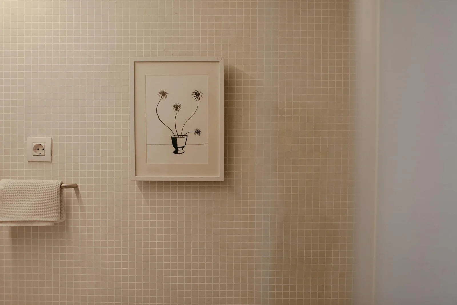
- Above the counter, between rows of cabinets: 30x40 or 40x50, seen close up while cooking.
- On or beside the hood: avoid directly above the burners (heat rises); prefer the return wall, at least 60 centimeters from the cooktop.
- At table height, in the eating corner: a 50x70 centered, as in a small dining room.
- On the free panel between door and cabinet: a vertical 30x40, caught on entering.
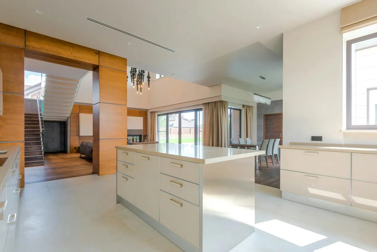
- On the back wall, facing the room: if you have an entirely free wall, a 50x70 or a trio of three aligned 30x40s.
The 60-centimeter rule
The one technical rule that really matters is distance from sources of steam and heat. An induction cooktop without a hood sends water vapor vertically up to 50 centimeters, sometimes more if you simmer for hours. The frame glass condenses, moisture eventually seeps in if the sealing is imperfect. Allow a minimum of 60 centimeters between the bottom of the frame and the highest cooking zone. Above a sink, the rule is looser (water does not rise), 30 centimeters is enough.
Format counts as much as distance. In a kitchen, 30x40 is almost always preferable to 50x70: it fits the leftover spaces between cabinets and windows without dominating the room. The 50x70 only works in open-plan kitchens or full living spaces, where you have the step-back distance to read it. Above a standard counter, with the frame at 1.40 meters, you look at the poster from one meter away. A larger format feels crushing.
Protecting the paper: closed frame, mat, plexiglass
Three technical precautions. First, choose a well-sealed frame, silicone or rubber gasket at the back, not a cheap clipped frame that will let steam in. Next, build in a cream-colored cardboard mat 4 to 5 centimeters between the paper and the glazing: this air pocket slows condensation and gives the poster time to breathe. Finally, prefer anti-glare plexiglass to bare glass: lighter, less fragile, and its surface treatment holds up better long term against suspended grease. All our Montmartre Poster frames, available from the frames and accessories page, build in these three elements as standard.
A kitchen does not need a Hokusai. A citrus plate above a zellige backsplash, and the room jumps a category instantly.
Themes by mood
A country kitchen, weathered wood, stone counter, calls for herbarium and herb plates in a natural oak frame. A modern black-and-white kitchen, quartz counter, exposed appliances, takes a red-and-black vintage cocktail in a matte black frame, or an espresso typographic print. A bistro kitchen, zinc and metro tile, recovers its brasserie spirit with a Campari or Suze poster from the 1930s and a thin black frame. Coherence comes from the dialogue between the kitchen material and the poster world.
At Montmartre Poster, the cocktails posters and the botanical collection cover most of what works in a kitchen. The kitchen and living selection further gathers the pieces most tested in this use, printed on 275 gsm art paper calibrated to handle the humidity swings of a lived-in kitchen.