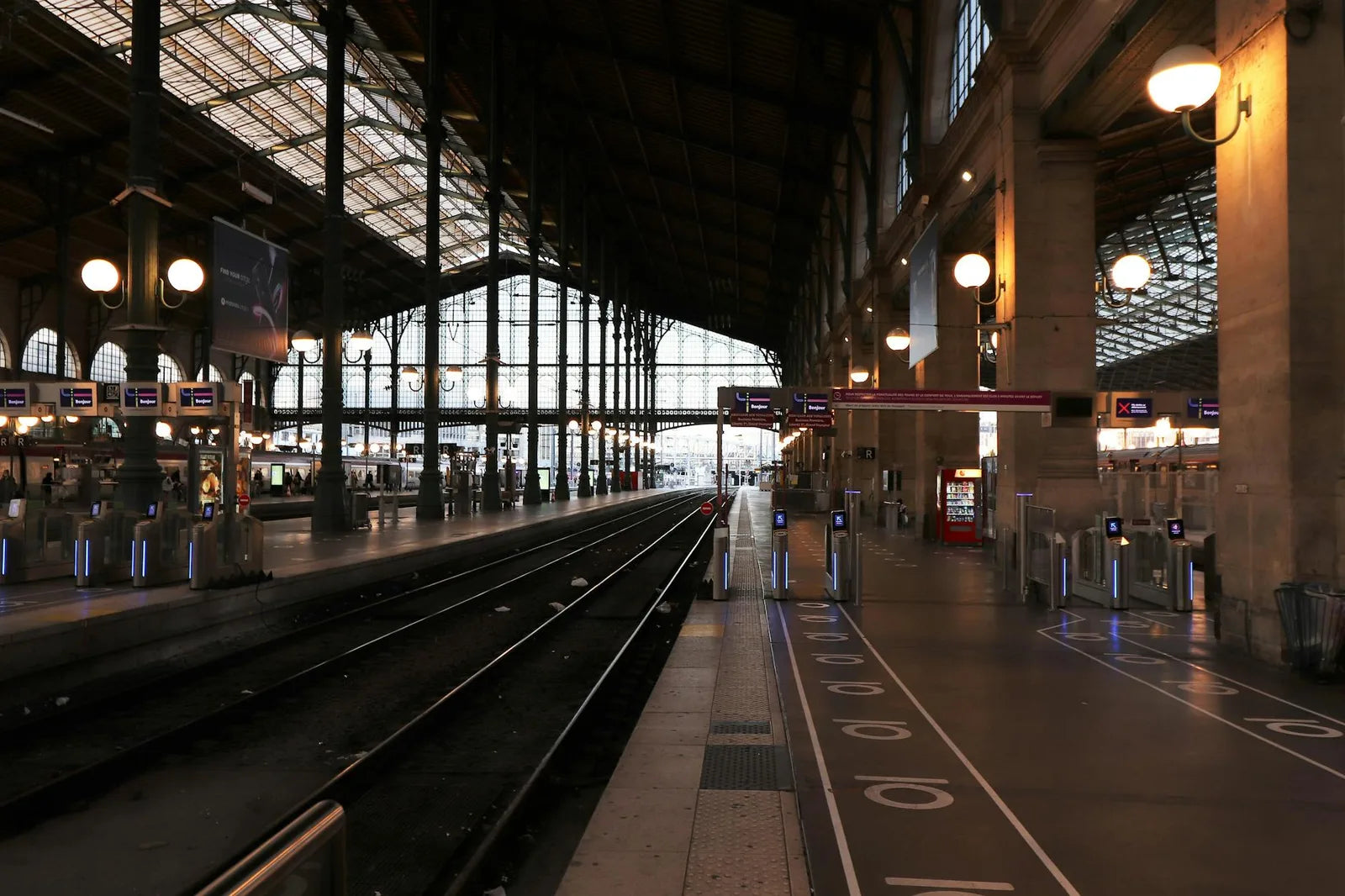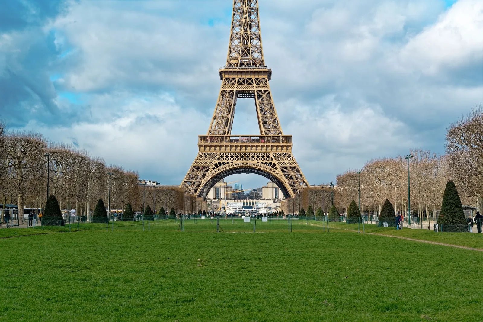
The Eiffel Tower was built between 1887 and 1889 for the World's Fair. Gustave Eiffel intended it to be temporary. It was scheduled for demolition in 1909. What saved it: the wireless telegraph antennae installed at its summit in 1898, which made it indispensable to military communications. The tower remained, and with it, the industry of its representations.
The first posters showing the Eiffel Tower date from 1889, the year of the Exhibition. They are in lithochrome, printed in Paris by the great graphic publishing houses (Chaix, Affiches Charles Verneau). The tower appears in the background of landscapes, with crowds of visitors in the foreground. It is not yet an icon - it is still a building among others, the tallest perhaps, but a building.
Iconisation through the poster
It is in the 20th century, and particularly between 1910 and 1950, that the Eiffel Tower becomes a graphic icon. Travel poster artists begin to depict it alone, simplified, as a symbol rather than a building. Cassandre treats it as a geometric form in his 1930s posters for the French Tourist Office. Paul Colin inserts it in the background of entertainment posters. Its silhouette becomes instantly readable even reduced to a few centimetres.
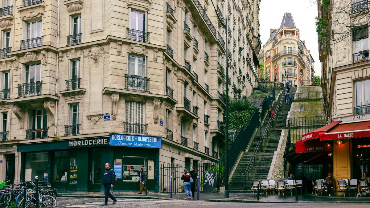
Montmartre has a different relationship with the poster. The neighbourhood has been, since Toulouse-Lautrec and the Moulin Rouge, the birthplace of the modern Parisian poster. Lautrec invented the entertainment poster in the streets of Montmartre in 1891. He worked between the Butte and Pigalle, in the cabarets and studios. The Montmartre poster is not touristic - it is artistic, social, rooted in the life of the neighbourhood.
What distinguishes a good Paris poster from a souvenir
The difference lies in the graphic treatment. A Paris souvenir shows the Eiffel Tower in a literal, photographic or hyperrealistic way, with "Paris" in cursive lettering and a cliche sky background. A good Paris poster treats the city as a graphic subject: it simplifies, it chooses an angle, it creates an atmosphere. A silhouette of the tower in flat midnight blue on a cream background - that is a poster. A retouched photograph of the tower with a vintage filter - that is a souvenir.
Toulouse-Lautrec sold his Moulin Rouge posters directly on the walls of Paris. Passers-by would peel them off at night to keep them. He invented, by accident, the market for collectible posters.
Choosing a Paris poster for an interior
For a French interior, a Paris poster should avoid the tourist anecdote. What works: a vintage tourism poster from the 1920s-1950s ("Paris, ville lumiere", in the style of PLM or the Compagnie generale transatlantique), a stylised graphic depiction of a neighbourhood (Montmartre seen from above, Saint-Germain with the Liberation cafes), or a typographic poster that plays on classic Parisian typography without photographing the subject.
For an interior abroad, the Paris poster can be more directly evocative - the Eiffel Tower is recognised the world over, and that is a legitimate graphic strength. What matters most is the quality of execution: precise graphic design, well-calibrated colours, a format that gives the image the space it deserves.