Florence, 1919. Count Camillo Negroni, a soldier returned from the war, walks into the Caffè Casoni on via dei Tornabuoni and asks Fosco Scarselli, the house bartender, to stiffen his usual Americano. More Campari, less soda, and gin in place of the sparkling water. The result fits in a low glass, on a single large cube, with a half slice of orange. That is the Negroni. The recipe has not changed since: one third gin, one third Campari, one third sweet vermouth. Three ingredients, three equal pours, a color that watercolor adores.
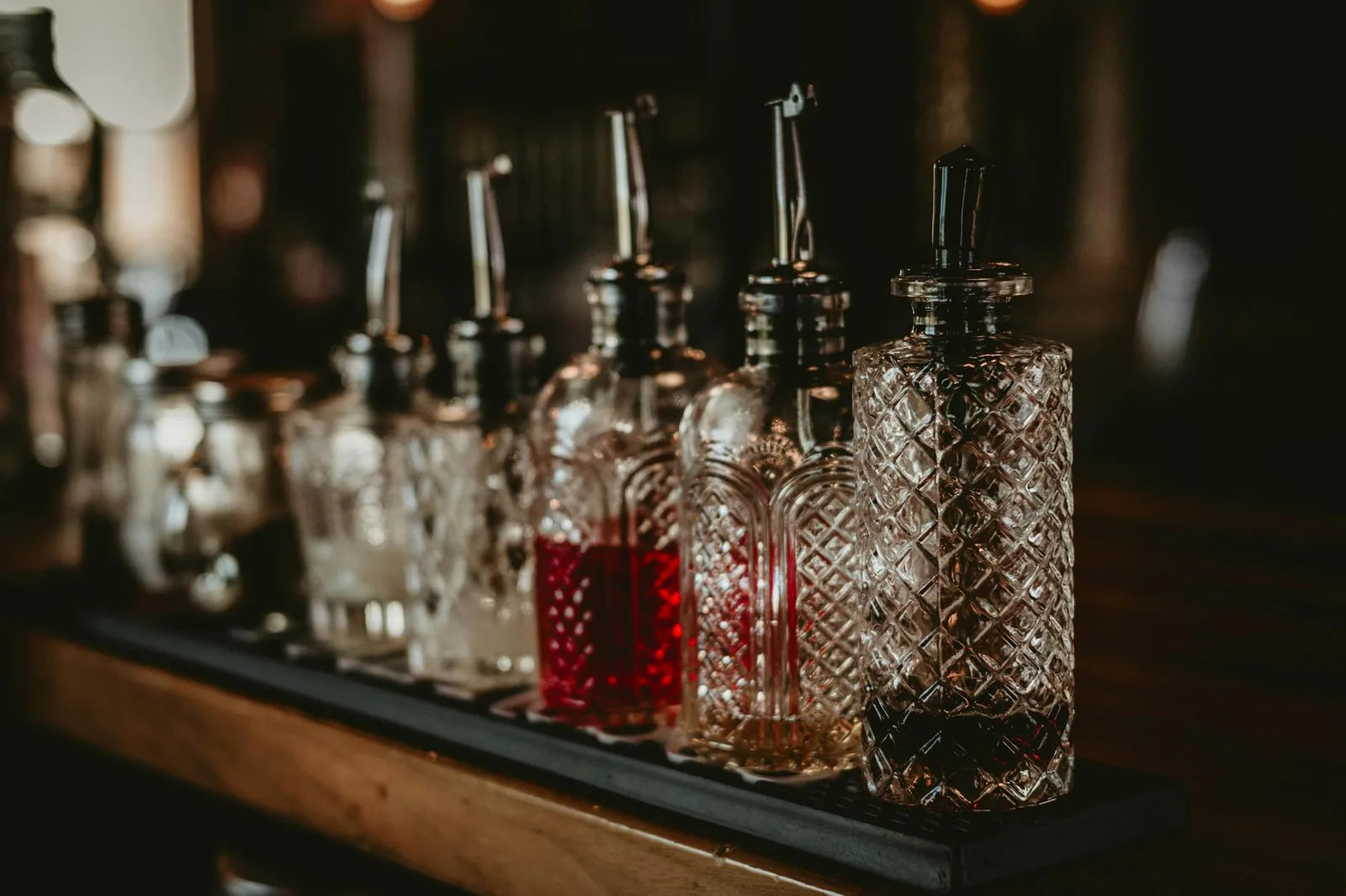
That simplicity explains why the classic cocktail met watercolor so well across the twentieth century. No need for a polished photograph. No need for a visible brand. A glass, an amber or red liquid, a garnish, and the composition holds. Italian poster artists in the 1920s and 1930s, in Milan especially, produced advertising plates for Campari, Cinzano and Martini that are collectors' items today. The technique was lithography in four to six colors, drawn from an original in gouache or watercolor. The grain of the paper stays visible under the pigment, and it is exactly that transparency we still look for today in a good cocktail poster.
The classic trio: Negroni, Boulevardier, Aperol Spritz
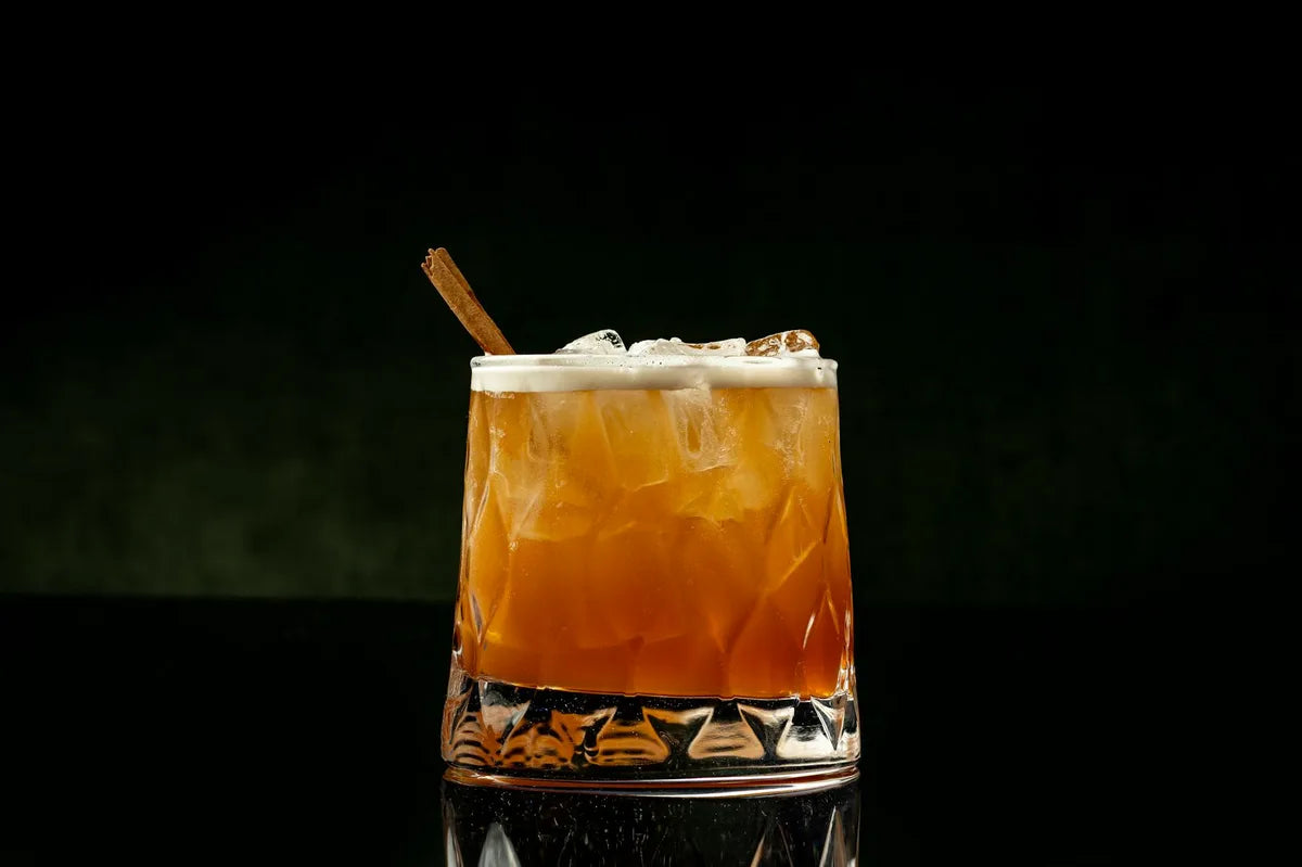
Three recipes have made it through the century without losing their drawing. The Negroni, we know. The Boulevardier, its Parisian cousin, is invented in 1927 by Erskine Gwynne, an American writer based in Paris who runs the magazine "The Boulevardier". He swaps the Negroni's gin for bourbon. The color shifts from clear red to a russet brown, the watercolor palette changes, and the cocktail takes on a winter warmth. The Aperol Spritz, the youngest of the three, is born in Venetian bars in the 1950s, around the Aperol liqueur perfected in Padua in 1919. The recipe settled late: three measures of prosecco, two of Aperol, one of soda, ice, and an orange slice. It is the sunniest composition of the trio, and the one that carries best in a large format.
What makes those three cocktails graphically useful is their restricted palette. The Negroni sits in warm reds and burnt orange. The Boulevardier adds a coppery brown. The Aperol Spritz turns around light orange and straw yellow. A successful poster does not try to imitate a photograph. It isolates the glass, lays down the color, plays on the transparency of the glass and the light running through the ice cube. Our classic Negroni watercolor poster picks up that stance: a centered glass, a cream ground, the color of the cocktail as the only accent. No logo, no overbearing typography. The recipe is in the hue.
Why the kitchen wants a cocktail poster
The kitchen is a room you rarely sit in. You pass through it on your feet, in often strong light. A poster designed for a living room, contemplative, made to be looked at slowly, loses its reason for being above a worktop. The cocktail poster, on the other hand, was made for that visual regime. It reads on the move. It sets a note of color in an already loaded environment (cabinets, hood, shelves, appliances). It comments on the use of the room without explaining it.
A cocktail poster in a kitchen does not decorate the wall, it qualifies the space. Dinner is simmering, the aperitif is waiting, the image has already announced it.
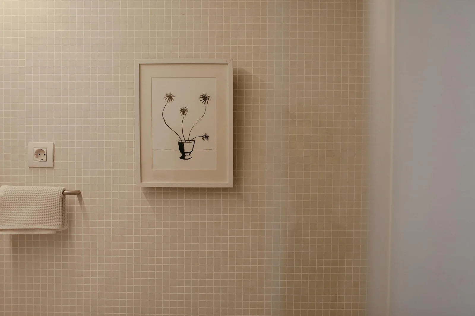
Format matters. In a kitchen, stay with 30 by 40 centimeters, sometimes 40 by 50 if the wall allows. 50 by 70 is already too much, except above a large counter dividing kitchen and living room. The reading distance is short, two meters maximum, and an intermediate format easily carries the image. The frame: light oak for a warm kitchen, matte black for a clean contemporary kitchen, never gilded (a gilded frame in a kitchen ages poorly, it merges with the faucet and loses its function as a frame).
How to pick: room palette first
The rule that works in a kitchen: look at the dominant color of the worktop, the cabinets and the visible elements (displayed crockery, bottles, teapots), then pick a cocktail poster whose main color answers that ensemble without copying it. A kitchen with teal cabinets will take an orange or red poster (complementary) without competing. A kitchen in blond wood and off-white will take a red Negroni or a russet Boulevardier without dissonance. A very dark, almost black kitchen welcomes a light-orange Aperol Spritz perfectly, which becomes the single lit anchor on the wall.
Three posters to begin with
- A Negroni glass isolated on a cream ground, dense watercolor, 30 by 40 format. The great classic that holds in every Western kitchen of the moment.
- An Aperol Spritz seen from above, floating orange slice visible, 40 by 50 format. The reading is more playful, the object more recognizable, ideal above a sink.
- A Boulevardier in profile, central ice cube, on a wood or kraft ground. 30 by 40 format, black frame. Ideal for a bistro or speakeasy kitchen.
At Montmartre Poster, the cocktails collection gathers a tight selection of watercolor plates, from the Negroni to the Old Fashioned via the Venetian Spritz. The works are printed on 275 gsm art paper, which restores the transparency of watercolor without saturating the color. The range expands regularly, drawn from original illustrations commissioned to contemporary watercolorists.