Paris, February 1903. Leonetto Cappiello, a young Italian illustrator who came to Paris in 1898 at the age of 23, signs for the Klaus chocolate brand a poster that will change his destiny and the trajectory of the commercial poster. The composition is simple: a red horse rearing on a black ground, a rider in a white costume holding a box of chocolate. No landscape, no setting, just the isolated figure and the title. The poster causes a sensation. Cappiello has just invented what historians will call the arabesque: an isolated figure, set on a plain black ground, that detaches itself instantly in the street. It is the break that separates Belle Époque advertising, still narrative and loaded, from the modern commercial poster, economical and memorable.
Between 1900 and 1942, Cappiello signs more than 530 posters. Vermouth, spirits, perfumes, chocolates, biscuits, cars, railways: his clientele crosses every major consumer brand of the first half of the twentieth century. Among those brands, several are large coffee and roasting houses: Café Martin, Café Maurin, Maxwell House, and above all, in 1929, the famous Café Klaus, whose poster, set on a black ground, shows a white Pierrot lifting a steaming cup. The composition becomes one of the most reproduced images in the history of French advertising.
Cappiello, method and black ground
Cappiello's method rests on three principles. First, the black ground: almost all his major posters sit on a deep black, which works as a sounding chamber for the main figure and lets the color burst out. Then, the single figure: a person, an animal, an object, never several. The figure must be recognized at ten meters, read at three, understood at one. Finally, movement: the figure is always doing something. The horse rears, the Pierrot raises the cup, the woman dances, the man runs. Movement is suggested, never explained.
For his coffee posters, Cappiello applies that grammar rigorously. The 1929 Café Klaus shows a smiling Pierrot in a white polka-dot costume, raising a steaming cup of coffee skyward in a joyful greeting. The title KLAUS sits at the bottom, in large gilded letters, no ornament. No plantation landscape, no roaster, no coffee beans. Just the figure and the title. That radical economy moves the poster from the informational register ("here is how we grow and roast our coffee") to the emotional one ("here is how you will feel drinking it"). That is the whole art of the modern brand.
The Italian school, Dudovich, Mauzan
Cappiello is not alone on the coffee subject. The Italian school of commercial poster design, sometimes called the Milan school, brings together several major illustrators. Marcello Dudovich, born in Trieste in 1878, signs between 1898 and 1962 over 1,200 posters, including several for Italian coffee brands. Achille Luciano Mauzan, a French painter based in Milan, delivers posters for Lavazza in the 1920s. His style blends Art Deco elegance with a taste for the individualized portrait that sets him apart from the Cappiello arabesque.
The French school is just as active. Charles Loupot, who works for PLM travel and with Cassandre in the 1920s, signs in 1932 a poster for Suchard coffee that becomes a classic: a white porcelain cup on a blue-checkered cloth, seen from above. Jean Carlu, more political, delivers in 1939 a poster for the Dupont café-restaurant that sets a typical Parisian scene: terrace, rattan chairs, marble counter. These posters, more narrative than Cappiello's, tell as much about the place as about the product.
Roasting as art
Beyond the great commercial posters, the subject of roasting itself gave rise to a discreet but constant sub-genre. The artisanal roasters of the big cities (Paris, Lyon, Milan, Turin, Vienna) commission, in the early twentieth century, posters that stage their tool: the great rotary drum heated by gas, the jute sacks carrying the names of origins (Mocha, Java, Colombia, Sumatra), the copper scales. These posters, more modest than the grand Klaus or Suchard campaigns, have a documentary flavor that makes them especially precious today.
A roasting poster draws its beauty from precision. The depicted roaster, often drawn from life, is technically accurate. Beans, sacks and scales are painted with a care that implies hours of observation at the shop. That quality of attention gives those posters a documentary weight one does not find in the great iconic compositions. They say: here is the coffee as it is made, here is the tooling, here is the hand of the roaster.
"A good commercial poster," Cappiello wrote in 1925, "sells twice. First time by catching the eye in the street. Second time by staying in the memory."
On the wall today
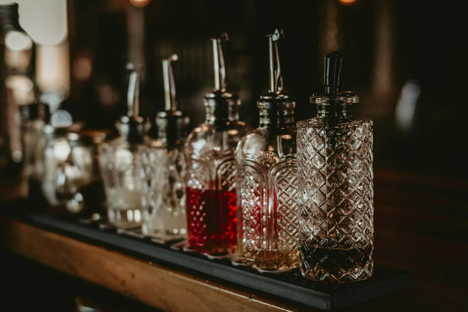
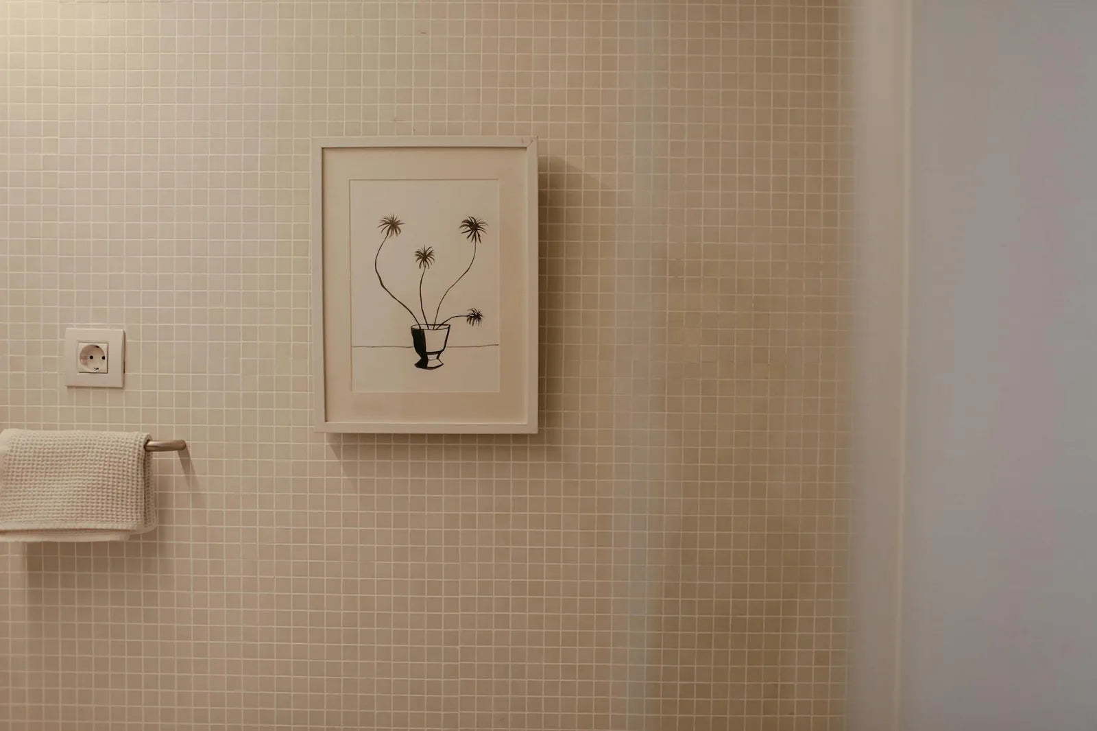
Vintage coffee posters occupy a particular ground in interior decoration. They evoke at once the kitchen, the morning ritual, the Sunday coffee, the espresso at a Parisian counter. They fit naturally in an open kitchen, a family bar, a breakfast-oriented dining room. Their palette is warm (browns, blacks, golds, reds), their composition often vertical, which suits narrow spaces between two cabinets or above a counter.
Suggested format: 30 by 40 centimeters for artisanal roasting posters (documentary composition, that supports close reading), 50 by 70 for great iconic compositions (Cappiello, Loupot, Dudovich). Natural oak or light wood frame to echo the copper and wood of the roasters, or matte black frame for the Cappiello arabesques on black ground, which extends their palette. Avoid the white frame, which dilutes the warmth of the composition.
Ideal location: the open kitchen, above the counter (kitchen reading distance is short, a 30 by 40 or 50 by 70 format is plenty). The coffee corner of a living room, next to a machine or a French press. The breakfast-oriented dining room, where the poster takes part in the morning ritual. Avoid: the bathroom (humidity), the bedroom (a too-stimulating palette), the office (offset subject).
Four starting points
- A Cappiello poster for Café Klaus (1929) or Maurin Quina (1906): black ground, isolated figure, saturated palette. For a kitchen bar or a dining room.
- A Marcello Dudovich poster for an Italian coffee brand: Art Deco elegance, individualized portrait. For an open living room or a reading corner.
- An artisanal-roasting poster from a Parisian or Italian house: copper roaster, jute sacks, scale. For an open kitchen or a coffee corner.
- A more narrative Charles Loupot or Jean Carlu poster: terrace, cup, checkered tablecloth. For a dining room or a family breakfast.
At Montmartre Poster, the cocktails collection and the kitchen and living collection bring together these posters in the great French and Italian commercial-poster tradition, printed on 275 gsm art paper. Coffee and the morning ritual find their place on the walls of contemporary kitchens, between the espresso machine and the east-facing window.