A staircase wall is like no other wall in a home. The floor is not horizontal, it rises. The eye is not still, it moves. Viewing distance changes at every step. And yet the stairway wall almost always stays empty, because nobody knows how to honor that pitch. The rule is in fact simple: the composition must follow the rail line, not the floor line. Once that principle is accepted, the staircase becomes the most generous wall in a home, because it is long, open, and crossed twice a day.
The ascending gallery wall rests on three choices: a hang line parallel to the rail, a constant spacing between frames, and a progression of sizes or subjects that paces the climb. That progression is what separates a successful staircase from a clumsy one in which the frames seem to float. The wrong instinct is to align frames at top or bottom as in a flat hallway: it looks wobbly, as if the pieces were sliding down.
The rail axis
Measure the staircase pitch (often around 30 degrees in standard French interiors). Trace a light pencil line parallel to the rail, about 145 centimeters above the nose of each step. That line becomes the central axis of the composition. Hang the centers of all frames on it, at regular intervals. Sizes can vary (alternating 30x40 and 40x50 works well), but the central axis stays fixed. That discipline gives the eye a vanishing line to hold onto during the climb.
Constant spacing
The other non-negotiable is the spacing between frames. Count 8 to 10 centimeters horizontally (measured between the lateral edges of successive frames), and a vertical spacing that follows the pitch. That constant spacing holds the whole, because it creates the sense of even progression. Variable spacing breaks the composition instantly: the eye looks for the logic, fails to find it, the overall effect blurs.
The number of frames depends on the length of the staircase. Reckon one poster every 60 to 80 horizontal centimeters. A 3-meter straight flight therefore carries 4 to 5 frames. An L-shaped staircase (longer) can carry 8 or more. Avoid overloading. An overcrowded staircase wall tires more than it stimulates, and the eye no longer knows where to settle during the climb. Five well-chosen pieces beat 10 piled up.
Progressive sizing
A more advanced variant is to grow formats progressively toward the top of the staircase. Start with a 30x40 at the bottom, climb to a 40x50 in the middle, finish with a 50x70 at the upper landing. That progression visually simulates the ascent: you begin by stepping up, you end by arriving. It works very well in open staircases with a visible landing. It works less well in enclosed or spiral staircases.
The staircase is the only wall in a home you cross without being able to stop. Compose for the passing eye, not the contemplative one.
Subjects, frames, safety
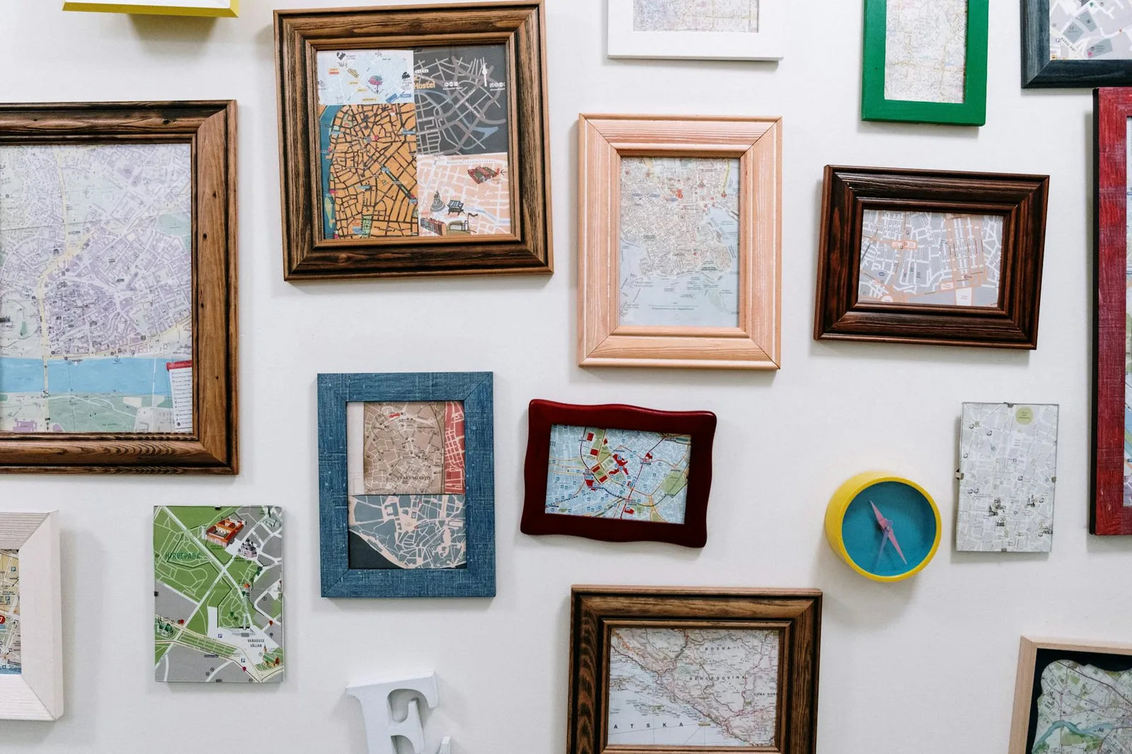
Subjects that work in a staircase: pieces readable at mid-distance, no great complexity, because no one stops to read them. Landscapes, architectural photography, botanical plates, simple typography. Avoid: overly busy pieces (gallery walls of gallery walls), expressive portraits (a frontal gaze on the landing makes you uneasy), very dark subjects (staircase lighting is often too dim to enjoy them). On frames: all identical, no exception, because the pitch already complicates reading and this is not the moment to add frame variation.
On safety: use fixings rated for the weight, given that a staircase is regularly crossed with cartons, bags or children brushing the walls. For a 50x70 oak-framed piece, a hook rated for 4 to 5 kilograms, screwed into a Molly anchor. All Montmartre Poster frames, available from the frames and accessories page, build in a standard wall fixing at the back, compatible with these hooks.
At Montmartre Poster, the full selection gives access to every subject calibrated for staircase use: landscapes, travel, botany, abstracts. Printed on 275 gsm art paper in standardized formats that compose easily in series.