The most common problem in a failed gallery wall: individually beautiful posters that have nothing to say to each other. A vivid red poster next to a soft green botanical plate next to a black typographic piece on white. Each piece is fine on its own. Together, it is visual noise.
The solution is not to go all black and white, nor to buy matching posters in the same style. The solution is to identify a colour thread, then choose posters that respect it. This thread can be a dominant colour, a palette of two or three colours, or a tonal value (light, dark).
Method 1: a shared dominant colour
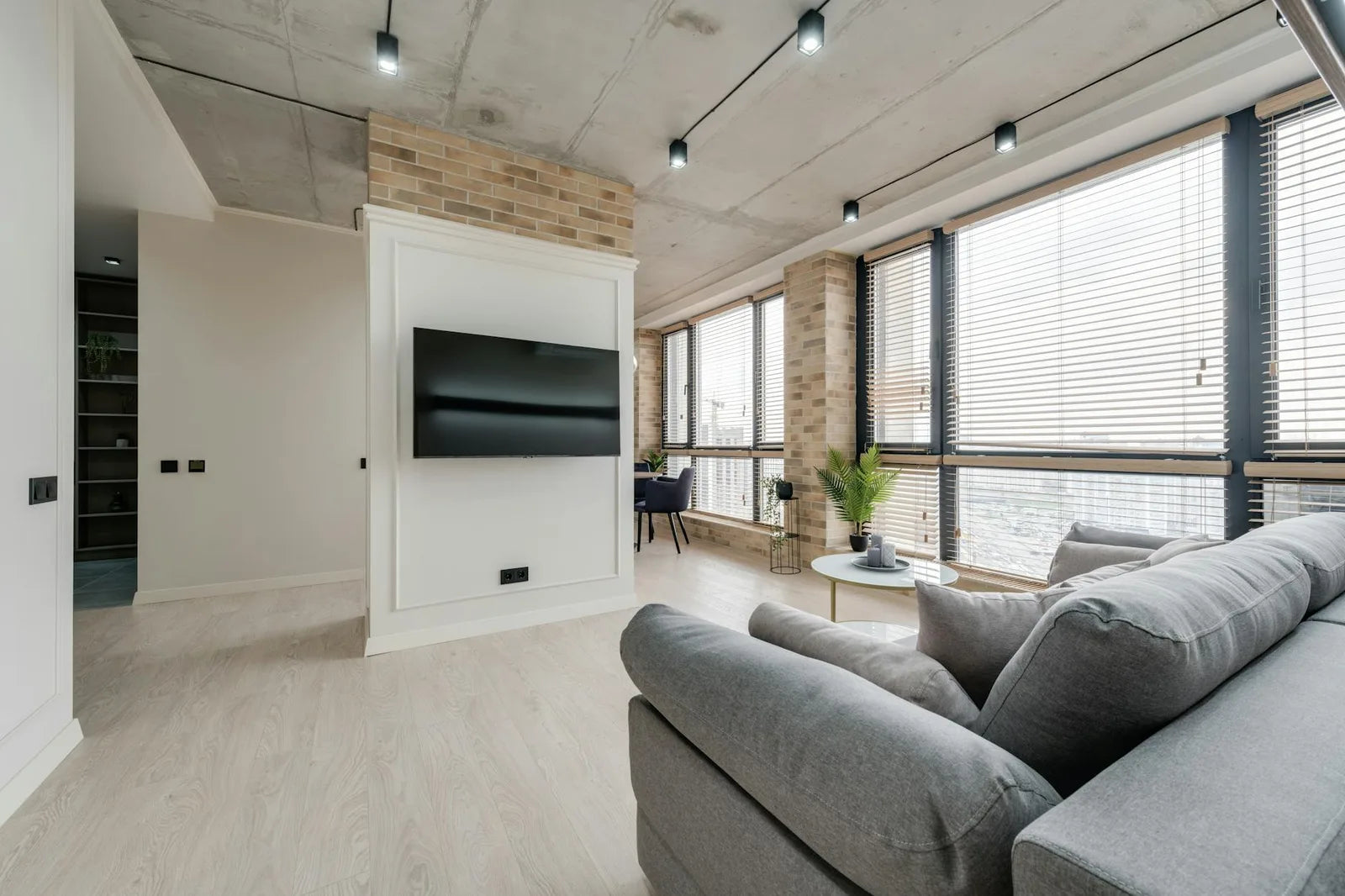
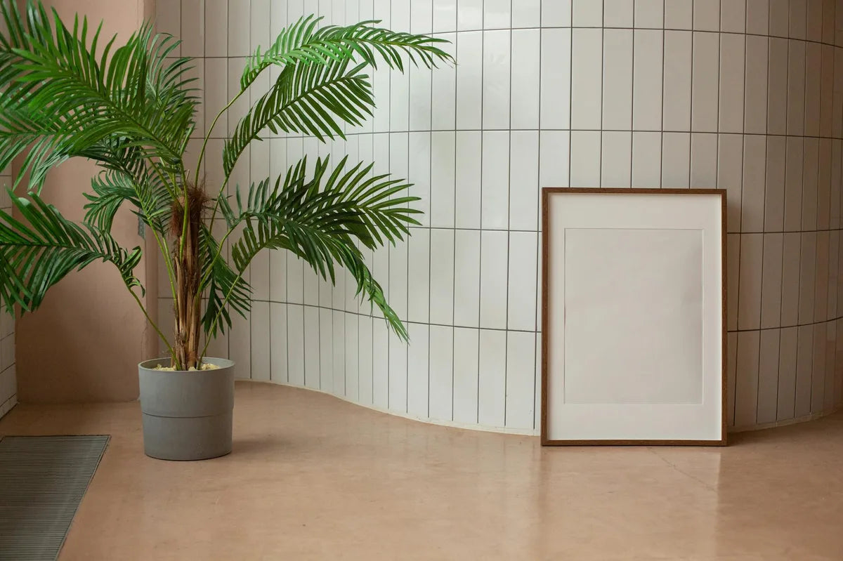
The simplest method. Choose a colour present in your room (the colour of the sofa, the rug, a cushion), and buy posters where this colour appears, even modestly. If your sofa is sage green, look for posters where a green, turquoise or blue-green is present. You do not need all your posters to be green: it is enough that they each carry a note of green, however subtle.
This method works with any dominant room colour. A living room with a navy blue rug: look for posters with blue, white or off-white. A living room with a terracotta armchair: look for posters with ochre, muted red, warm beige. The colour thread gives you a coherence the eye perceives immediately, without consciously registering it.
Method 2: the analogous palette
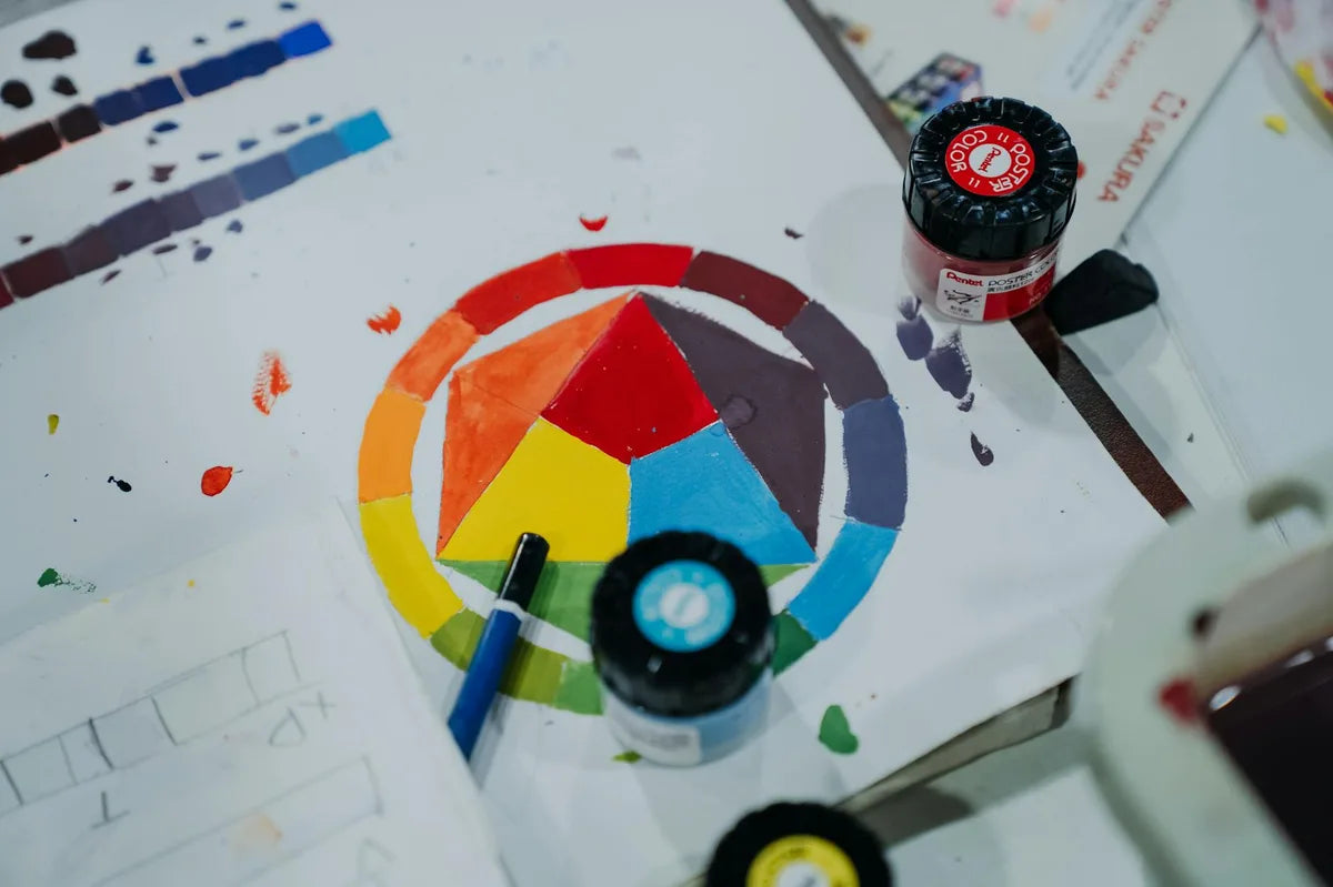
Analogous colours are neighbouring colours on the colour wheel. Blue, blue-green, green: analogous. Orange, red-orange, red: analogous. Ochre, brown, terracotta: analogous. A set of posters in analogous colours has a natural harmony because the tones blend into each other without friction.
Painters learn to compose their palettes before painting. Interior designers do the same before buying posters. It is not a constraint: it is a framework that makes choices easier.
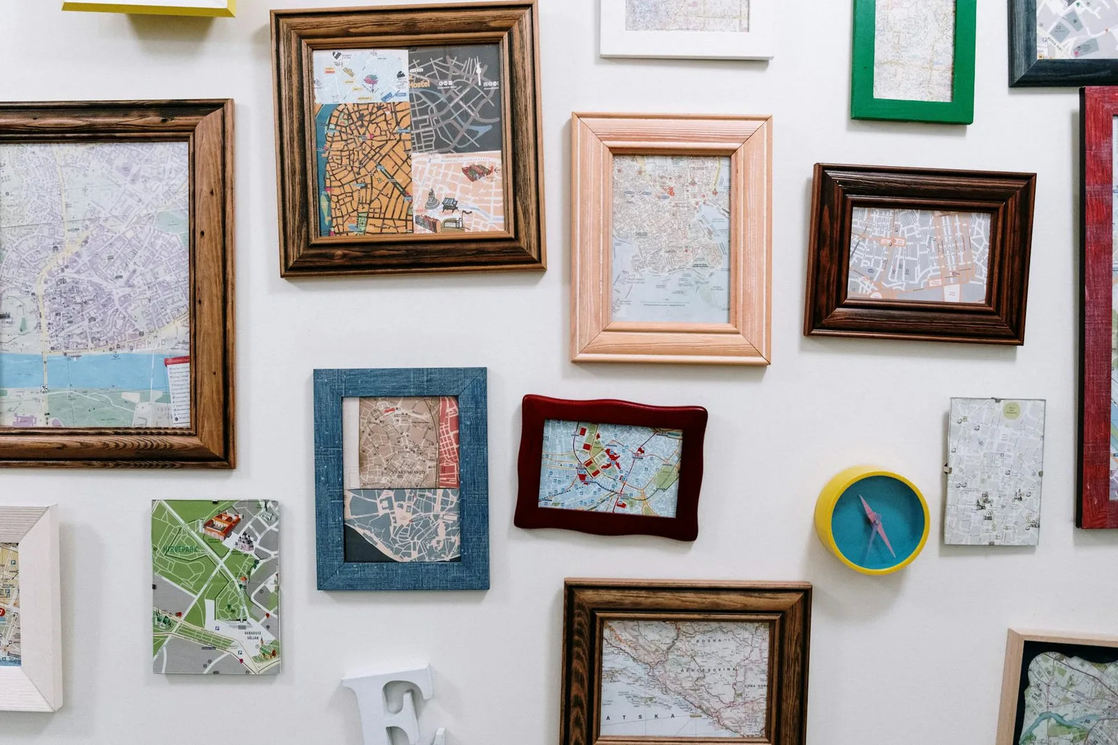
Method 3: unification through the frame
If you have posters with varied colours that you want to hang together, the frame can create unity in place of colour. All frames in matt black, all frames in the same oak: the unity of the frame compensates for the diversity of the posters. It is the method gallerists use to show works by different artists: identical frames give visual coherence to any grouping.
What to avoid
- Mixing highly saturated complementary colours (vivid red and vivid green, vivid orange and vivid blue): the contrast is too strong and tires the eye.
- Having one very colourful poster in a set of neutral pieces with no colour bridge between them: the vivid poster looks isolated and incoherent.
- Buying all your posters in the same beige and off-white range: it can work, but is often lifeless.
- Ignoring wall colour: a dark green wall completely changes the reading of the colours in the posters hung on it.