The rule that works - we have known it for twenty years: before hanging anything, lay all the posters on the floor against the target wall and move the pieces around for half an hour. It is laborious, it is slow, and it prevents roughly 90% of mistakes. If you do not have thirty minutes, come back later.
Three Safe Compositions
The perfect grid. Three or four posters in the same format, in identical frames, aligned with a plumb line. This is the composition that requires the least thought and holds up best over time. Ideal for a corridor, an enfilade, above a bench. Spacing: 6 to 8 centimetres between frames. The viewer's eye settles at the centre of the composition, which should be at 150 centimetres from the finished floor.
The balanced asymmetric. One large central poster (70 by 100 format, or 50 by 70 in vertical orientation), surrounded by 3 to 5 smaller posters arranged in a cluster. This is what you see in most Pinterest interiors. The rule that makes it legible: a single visual centre, with all secondary pieces orbiting it at comparable distances. No more than two different orientations (portrait and landscape).
The horizon line. Four to six posters aligned at the top, hung at the same level, but with different frame heights. Reading left to right, like a frieze. Works very well on a long wall (corridor, dining room). Avoid above a sofa: the low horizon line cuts the eye.
The Most Frequent Mistake
Hanging too high. The centre of a poster should be at eye level for someone standing in the room, between 145 and 152 centimetres from the floor. If you are taller, stay at 150. If the poster is above a sofa, allow 20 to 25 centimetres between the top of the back and the bottom of the frame. Above a dining table, allow at least 60 centimetres between the table and the bottom of the frame.
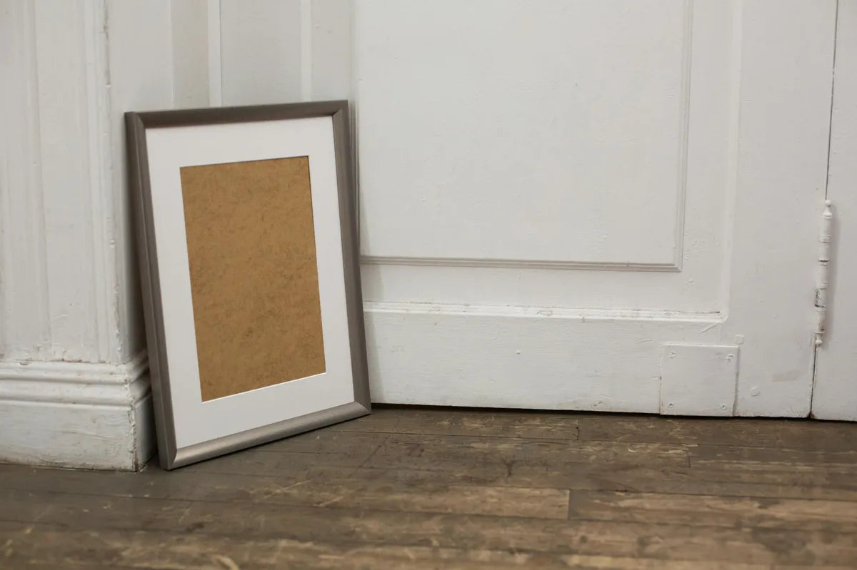
The visual centre of the composition should be at 150 centimetres from the floor. This rule comes from museum hanging, not from design.
Tools, Method, Finishing
- Masking tape (the only kind that does not mark paint). Cut templates to the exact dimensions of the frames, tape to the wall, live with it for a week if possible.
- Short spirit level (30 centimetres). Essential.
- Hook suited to the frame weight. A 50 by 70 oak-framed format weighs about 1.5 kilograms. A 70 by 100 weighs 3 to 4 kilograms depending on the glass.
- Screws in the wall, not nails. More stable, safer.
- For plasterboard walls, use Molly bolts. For stone or brick walls, drill and use standard plugs.
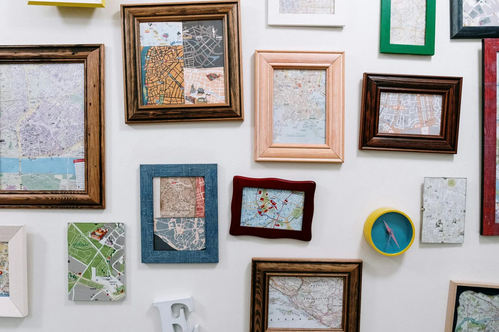
Mixing Photography, Drawing, Typography
The trap is incoherence. For a mixed wall to work, there must be a common denominator. Either the frame (all black, or all oak). Or the palette (warm tones, or cool tones, but not both). Or the era (all vintage, or all contemporary). If you have no common denominator, it will look like a jumble sale, and you will feel it.
A tip for very busy walls: pull 50% of the pieces back into uniform black or cream frames, and leave the remaining 50% in a slightly contrasting frame. The eye organises the composition into two groups on its own.
Final advice. A gallery wall composition is never finished. You can add, remove, move a piece every three months. That is even the principle. Frozen walls age badly.