April 1919. Walter Gropius, aged 36, releases from Weimar the Bauhaus manifesto. The opening sentence has stayed: "The final goal of all creative activity is construction." The school opens with nineteen students in the buildings of the old Weimar fine-arts academy. One hundred years later, the Bauhaus has entered UNESCO World Heritage, its alphabet has shaped every contemporary sans-serif typeface, and its exhibition posters have become collectors' items.
That hundred-year run raises a simple question: why does a movement that only lasted fourteen years, shut down in 1933 by the Nazis, still work in interior decor today? The answer lies in three things: a formal vocabulary of total legibility, a pedagogy that spread across three continents, and a graphic economy perfectly suited to the walls of the twenty-first century.
The centenary and what it stirred
In 2019, Germany staged a centenary on the scale of the event. The Bauhaus-Archiv in Berlin completely reworked its permanent display. Dessau reopened its workshops, restored exactly to Gropius's 1925 plan. Weimar inaugurated a new museum. Auctions of original Bauhaus furniture broke several records. A Brno chair by Mies van der Rohe, designed in 1929, went for 65,000 euros at Wright Auctions in Chicago.
The effect on the poster market was immediate. Bauhaus exhibition posters from 1923-1929 (lecture programs, student festivals, Werkstatt exhibitions) are rare in good condition. A Joost Schmidt original for the 1923 Bauhaus exhibition routinely reaches 8,000 to 15,000 euros at auction. Later editions authorized by the heirs remain affordable. And free reworkings in the Bauhaus language, primary shapes, color planes, sans-serif typography, have found a stable audience over the past decade.
Why these posters hold up
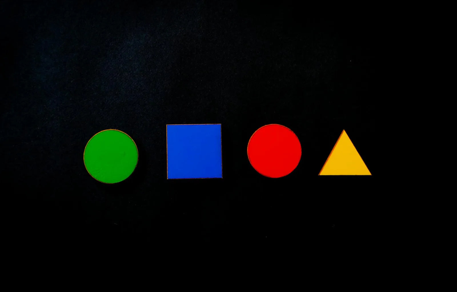
Four technical reasons. First, the palette: three or four colors maximum, drawn from Johannes Itten's color wheel taught from the 1919 preliminary class onward. That discipline keeps saturation in check and gives every piece a memorable signature. Then geometry: circle, square, triangle, straight line. No ornament, no filigree. The Bauhaus broke with Art Nouveau on that point in 1923 and never walked back.
Third reason: typography. Herbert Bayer drew in 1925 his "universal alphabet", all lowercase, sans serif, geometrically built. The sentence he tied to the project ("Why two alphabets if one will do?") set the direction of Swiss, American and French typography for fifty years. Fourth reason: format. Bauhaus posters were designed for walls seen at short distance, two to three meters, exactly the reading distance of a poster in a living room or apartment hallway.
Our Bauhaus poster with turquoise waves picks up that grammar: a simple shape, repeated in series, on a plain ground, in a restricted palette. It is the kind of piece that holds on a wall for years without dating.
Bauhaus visual language survives because it is legible. A red circle, a blue plane, a geometric typeface: you recognize it instantly, even without naming it.
Pairing Bauhaus with vintage travel
A question that often comes up in the shop: do these very geometric Bauhaus posters pair with the illustrative vintage travel posters of 1925-1935? The answer is yes, with a few rules. The Bauhaus and Art Deco actually share the same period (the two currents meet in Paris at the 1925 International Exhibition) and the same taste for color planes and tight compositions. A Cassandre Nord Express and a 1923 Bauhaus Werkstatt poster talk to each other better than one would expect.
Three rules. First, share a palette: if your Bauhaus is in blues and yellows, pick a travel poster that contains at least one of those two colors. Then alternate formats and orientations: a portrait Bauhaus 50x70 next to a landscape Cassandre 70x100, the format contrast offsets the palette kinship. Finally, identical frames: matte black across the wall, or oak across the wall. Mixing frame finishes kills the harmony.
Four posters to begin with
- A composition with primary shapes: circle, square, triangle in a three-color palette. Kandinsky's founding exercise of 1923, and it still works.
- A typographic poster: one word, one letter, one grid. Picks up Bayer's 1925 language, perfect above a desk or in a hallway.
- A composition of repeated lines, like our turquoise waves. The Dessau Werkstatt aesthetic, ported to contemporary decor.
- A studio plate: reproduction of a teaching exercise by Klee or Itten, in an intimate format above a workspace.
At Montmartre Poster, the Bauhaus geometric collection gathers these different threads, printed on 275 gsm art paper. You can also cross-shop with the vintage travel collection to build a wall that spans fifty years of European graphic design, holding everything together with a single palette.