Paris, October 1891. Charles Zidler, manager of the Moulin Rouge open since 1889 on the place Blanche, asks a young Montmartre painter for a poster to relaunch the winter season. The painter is Henri de Toulouse-Lautrec. He is 27, stands 1.52 meters tall because of a bone disease inherited from his parents' aristocratic consanguinity, and lives a few steps away in a studio on rue Caulaincourt. Three weeks later he delivers a lithograph in four colors, 191 by 117 centimeters, showing the dancer La Goulue with her legs in the air, her partner Valentin le Désossé in a black silhouette in the foreground, and behind them the crowd reduced to flat silhouettes. The poster is printed in three thousand copies, pasted on the Morris columns of Paris. It changes everything.
Before Toulouse-Lautrec, the poster existed, but it imitated academic painting. Jules Chéret, considered then the master of the genre, drew women in motion, joyful, in a pleasing pastel palette and an elegant line. A "chérette", as people said at the time, sold champagne or chocolate with the smile of a boulevard character. Toulouse-Lautrec drops all of that at once. His Goulue is not idealized. She is caught in mid-gesture, almost vulgar, legs apart, petticoat visible. The thick black contour of the silhouettes, the brutal flat of yellow light on her dress, the composition in compressed perspective: you immediately recognize the debt to Japanese print.
The Japanese debt
Toulouse-Lautrec collected ukiyo-e prints. Hokusai, Hiroshige, Utamaro hung on the walls of his studio from 1888 on. What he takes from ukiyo-e is not anecdotal. It is the composition itself. The framing that cuts a figure at the edge, the flat color without modeling, the black contour that draws the form without sculpting it, the perspective that flattens depth into stacked planes. All of that comes from Japanese prints. Before Toulouse-Lautrec, those techniques were viewed in France as exotic curiosities. After him, they become the grammar of all European poster work, from Mucha to Cassandre, with a parallel line through Beardsley in England.
The technique deserves a pause. Lithography, invented by Aloys Senefelder in 1796, relies on the chemical antagonism between water and grease. The artist draws on a porous limestone slab with a greasy crayon or ink. The stone is then dampened, water adheres to the undrawn areas, printing ink adheres to the greasy areas. One stone per color, four to six colors for a poster. Toulouse-Lautrec drew directly on the stone, with no preparatory drawing, which was rare. He took his time, picked his pigments himself, watched the print run. Thirty-two posters came out of that practice between 1891 and 1900, including the best known: the Goulue, Jane Avril (1893), Aristide Bruant (1893), May Belfort (1895), Divan Japonais (1893).
Montmartre, absolute subject
Toulouse-Lautrec lived Montmartre, he did not observe it from the outside. He had dinner at Aristide Bruant's Mirliton, followed Jane Avril backstage at the Jardin de Paris, painted Yvette Guilbert at the Divan Japonais, drew La Goulue at the Moulin Rouge. His subjects are all acquaintances, sometimes friends. That familiarity changes the gaze. He is not an illustrator who aestheticizes Paris nightlife, he is a witness who restores its harshness, the mechanics of the music hall, the exhaustion of the dancers at dawn. That is what gives his posters their hold: there is a human truth underneath, not only a graphic search. He dies in 1901, at 36, worn out by alcohol and syphilis.
"I will paint until I am 40," Toulouse-Lautrec told his friend Maurice Joyant. "After that, I will stop." He made it to thirty-six.
Living with a Toulouse-Lautrec on the wall
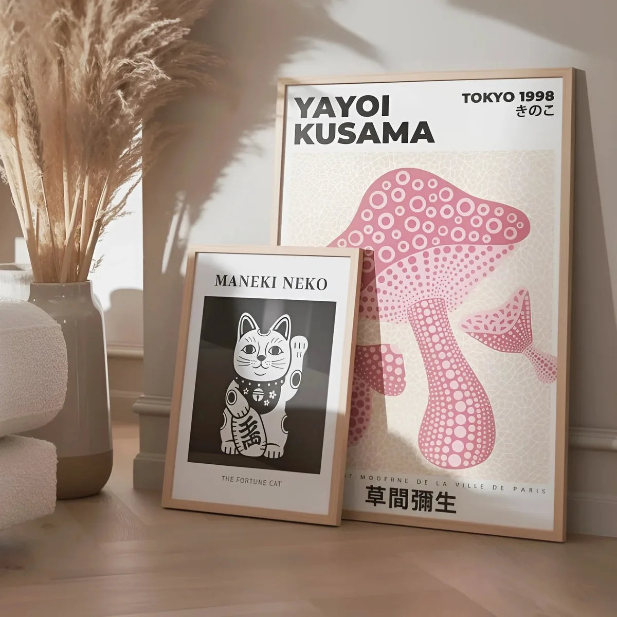
A Toulouse-Lautrec poster, or its Belle Époque tribute, calls for a respectful wall. No clutter around, no gallery wall that dilutes it. One piece, centered, in a matte black frame with a thin profile. Black picks up the black contours of the composition and gives the flat color its full punch. Size also matters. The original is nearly two meters tall, not viable indoors. A reproduction at 50 by 70 or 70 by 100 keeps the essential gesture without overrunning the room. Above a low sofa, in a hallway, or facing the front door so that it is seen on arrival: those are the three good spots.
Toulouse-Lautrec's palette works well in dark interiors. English green, burgundy, teal walls. The yellows and oranges of his posters stand out against deep grounds. On a very light wall, the poster can read cold. If you want a white wall, pick a piece dense in black (Aristide Bruant, for instance, with his hat and red scarf on a flat ground) rather than an airy composition. The palette / wall match does half the work.
To start a selection
- A Belle Époque cabaret poster dominated by black (Moulin Rouge, Chat Noir, Divan Japonais). 50 by 70, black frame, dark wall.
- An Art Nouveau poster from the same decade for a dialogue (Mucha, Steinlen). The kinship of style is immediate, the palette shifts.
- An Art Deco poster from the next decade, to show how Toulouse-Lautrec's grammar hardens in the 1920s.
At Montmartre Poster, the vintage collection brings together Belle Époque posters and contemporary tributes to that period. The Art Deco collection carries the story into 1920-1939. To follow the full arc from Toulouse-Lautrec to Cassandre, see our article Cassandre and the golden age of the travel poster, which describes how the grammar invented in Montmartre in 1891 went on shaping graphic design until 1939.