1927. Cassandre designs the poster for the "Nord Express", for the Wagons-Lits company. The train charges to the right against an incandescent red sky, perspective crushed to a flat plane. Three telegraph lines converge at the vanishing point. No face, no figure. The poster works on three flat colours and a geometric typeface. It is a revolution.
The artist's real name is Adolphe Mouron. Born in Kharkiv in 1901, trained at the Académie Julian in Paris in the early 1920s, he chose the pen name "cassandre" in reference to the Trojan prophetess. He is 26 when he delivers the "Nord Express". He has just invented a grammar that will structure an entire decade.
Art Deco Takes to the Streets
The 1925 Paris Exposition internationale des arts décoratifs fixed a style: refined geometry, bold flat colours, typefaces drawn like objects. But Art Deco remained confined to wealthy interiors, luxury ocean liners, hotel lobbies. Cassandre and his contemporaries brought it into the street.
Roger Broders worked for the PLM company (Paris-Lyon-Mediterranean). Between 1922 and 1932 he signed over eighty posters that defined the tourist imagery of the Cote d'Azur and the Alps: skiers in full swing, bathers at Juan-les-Pins, racing cars speeding along the Promenade des Anglais. His compositions are recognizable at a glance: a stylized figure, a simplified landscape, a hand-lettered title.
Jean Carlu was more political. He signed posters for the Compagnie generale transatlantique, but also Republican propaganda campaigns during the Spanish Civil War. Charles Loupot occupied an intermediate position: he made chic travel work (Lufthansa, Cote d'Azur) but also pure commercial work (Saint-Raphael, Valentine).
A successful poster, Cassandre used to say, reads at thirty metres and is understood at ten.
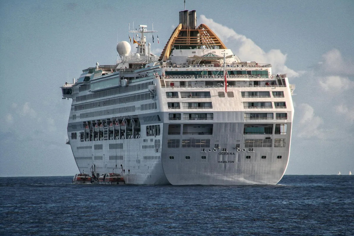
The Normandie, the Apex
1935. Cassandre delivers a poster for the ocean liner Normandie, the world's largest transatlantic ship, launched that year. The composition is now famous: the ship seen head-on, vertical bow, two symmetrical funnels, viewed from below. No sea, no horizon. The vessel fills almost the entire poster. The typeface "NORMANDIE" is set at the bottom, geometric, monumental.
This poster can be read in two ways today. It is a masterpiece of composition (balance of masses, economy of means, dramatization through viewpoint). It is also the symbol of the end of an era. The 1929 crash had weakened the transatlantic companies. War was approaching. The Normandie would be requisitioned by the US Army in 1941, gutted by fire in New York in 1942.
Why These Posters Still Hold
Four reasons. First, the quality of the drawing: these poster artists could draw by hand, without photographic reference, working within the constraints of lithographic printing (six to eight colours maximum, separations prepared in coloured pencil). Then, economy of means: no overloading, no unnecessary decoration. A silhouette, a light, a title.
Third reason: trust in the viewer. A Cassandre poster explains nothing. It suggests, it conveys a feeling, it sets an atmosphere. Travel is treated as a promise, not a product. Finally, these posters were designed for highly visible walls: station facades, street hoardings, carriage interiors. Format matters. Most were 100 by 70 centimetres, sometimes larger.
Our current reproductions, on 275 g/m² fine-art paper, respect the original colours as documented by the Bibliotheque Forney in Paris, which holds several hundred lithographic plates from this period.