Burbank, California, winter 1942. On a Warner Bros. illustrator's table, a large sheet of bristol is waiting. The film is called Casablanca. The studio already knows that Humphrey Bogart and Ingrid Bergman will fill the whole composition. The brief fits in one sentence: show the two faces, the gun, the city, and make the viewer believe in a romance set in chaos. One poster, four messages, two weeks to deliver them to theaters. The golden age of the American film poster is written in that kind of urgency.
Between 1930 and 1950, Hollywood studios produce tens of thousands of posters on their own. The system is industrial. Each film receives its full advertising package: one-sheet at 27 by 41 inches (the American standard), three-sheet, six-sheet, press kit, black-and-white photographs for newspapers. Everything passes through the studio publicity departments, in Los Angeles or in New York. Everything is hand-painted, photographed, color-separated for lithography.
The studio system
Each major graphics department has its own signature. Metro-Goldwyn-Mayer cultivates glamour: pink sky, long gown, blurred face, gilded typography. Paramount prefers strong contrast, sharp shadow, diagonal composition. Warner Bros. moves toward film noir, deep blacks, blood reds. Twentieth Century-Fox alternates, depending on its production cycles. Each studio also keeps illustrators under contract, and a handful of names have stayed.
Reynold Brown, who signs hundreds of posters for Universal and Columbia in the 1950s, paints in gouache and oil on board. Bill Gold works for Warner across five decades and signs the compositions of Casablanca in 1942, A Clockwork Orange in 1971, Unforgiven in 1992. The studios pay well: a recognized illustrator earns between 500 and 2,000 dollars per poster, a considerable sum at the time, more than a skilled worker's monthly wage.
Saul Bass and the 1950s break
In 1955, Otto Preminger commissions a young Los Angeles graphic designer to create the poster for his film The Man with the Golden Arm. The designer is named Saul Bass. He is 35. His proposal breaks with everything Hollywood has done until then: no photograph, no star's face, no gilded typography. A stylized arm, a black ground, the title in large white letters. Preminger approves. The poster causes a scandal in the trade and immediately enters history.
Bass will go on to sign Hitchcock's Vertigo in 1958, Preminger's Anatomy of a Murder in 1959, Hitchcock's Psycho in 1960, West Side Story in 1961. His grammar: clean flat areas, geometric shapes, sober typography. He also brings the animated title sequence into cinematic language. Before Bass, title sequences are static cards. After him, they are narrative passages.
Drew Struzan and the return of painting
One might assume photography killed the painted poster. Not quite. From the 1970s onward, several American directors revive the practice of commissioning illustrations. George Lucas asks Drew Struzan, a Californian illustrator born in 1947, to paint the Star Wars posters from 1977. Steven Spielberg commissions the Indiana Jones series from 1981. Robert Zemeckis the Back to the Future ones in 1985.
Struzan paints with airbrush and acrylic on illustration board. His technique blends photographic precision with painterly modeling: faces are instantly recognizable, yet the whole image still breathes the brush. That choice, against the grain of the digital era, gives the films he works on a lasting visual signature. Signed Struzan originals now trade between 30,000 and 80,000 dollars at American auctions.
"A movie poster," Saul Bass wrote in 1965, "must do what the trailer cannot: hang on a wall for weeks, and keep making you want to come back."
Why the genre comes back to the wall
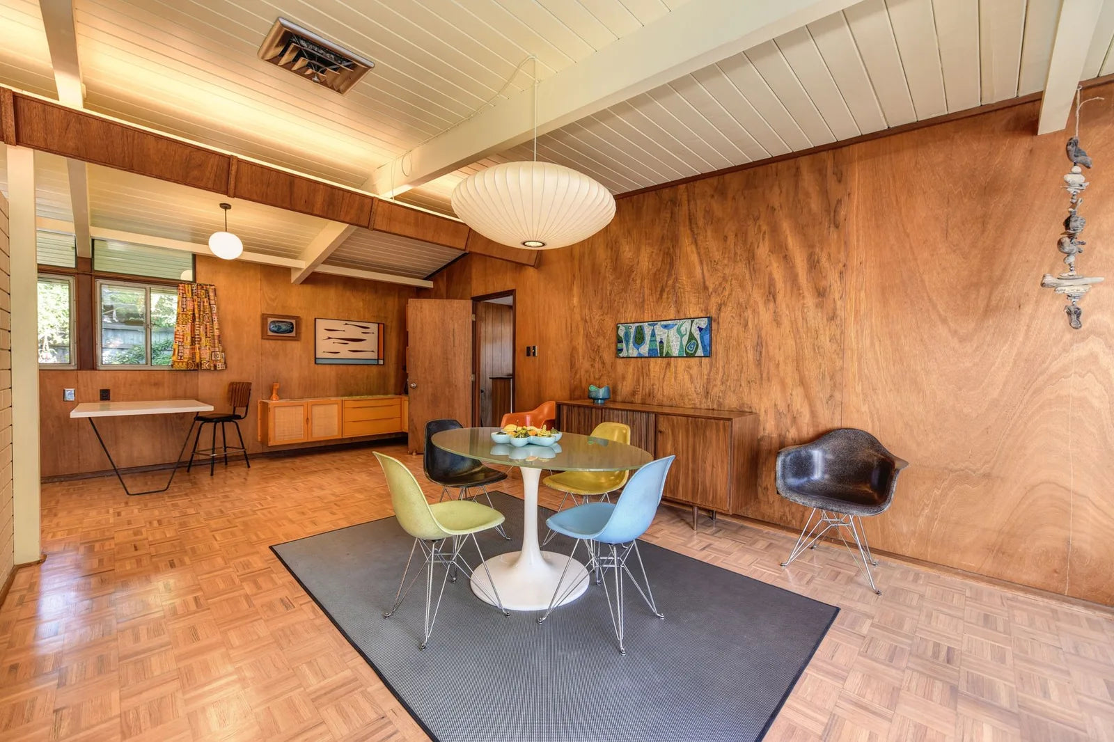
The Hollywood movie poster has two rare properties for interior decoration. First, it is built to be seen from a distance: the studios wanted an impact from ten meters away, from the sidewalk or from the entrance of a cinema. That long-range legibility works at home as well, in a hallway, above a console, in a stairwell. Second, it carries a story: a film one has seen, an era one loves, an actor one has admired. It is never purely decorative.
For a living-room or office wall, the 1940-1950 compositions work well at 50 by 70 centimeters, framed in matte black. The more illustrative pieces of the Struzan school call rather for 70 by 100, on a light wall, so that the painterly matter can unfold. Avoid the gilded frame: it weighs the image down, and it clashes with the often-gilded typography of the originals.
Three ways to start
- A poster from the 1940-1950 period in a classic composition: stylized face, strong shadow, worked typography. Ideal for a vintage living room or a dark-toned office.
- A Saul Bass poster: Vertigo, Anatomy of a Murder, The Man with the Golden Arm. Three titles that sit well in a graphic interior, next to a Bauhaus piece or an abstract composition.
- A Drew Struzan poster: a touch warmer, more narrative, perfect in a reading corner or a child's room that loves the pop-culture classics of the 1980s.
At Montmartre Poster, the vintage collection brings together posters in the spirit of that great graphic tradition, printed on 275 gsm art paper. The Hollywood cinema language meets there the world of ocean liners, jazz and Art Deco liners: three neighboring worlds that share the same decade and the same promise, that of a common imagination.