The frame matters more than people think. A good poster in a bad frame becomes ordinary. A middling poster in a good frame takes on another dimension. The frame is what turns a printed image into a piece of decor. At Montmartre Poster, we offer three main woods in solid European stock, 18 millimeter profile, anti-reflective Plexiglas glazing and an integrated cream mat board: natural oak, matte black, and white. The full sizing details sit on each frame product sheet, reachable from the frames page.
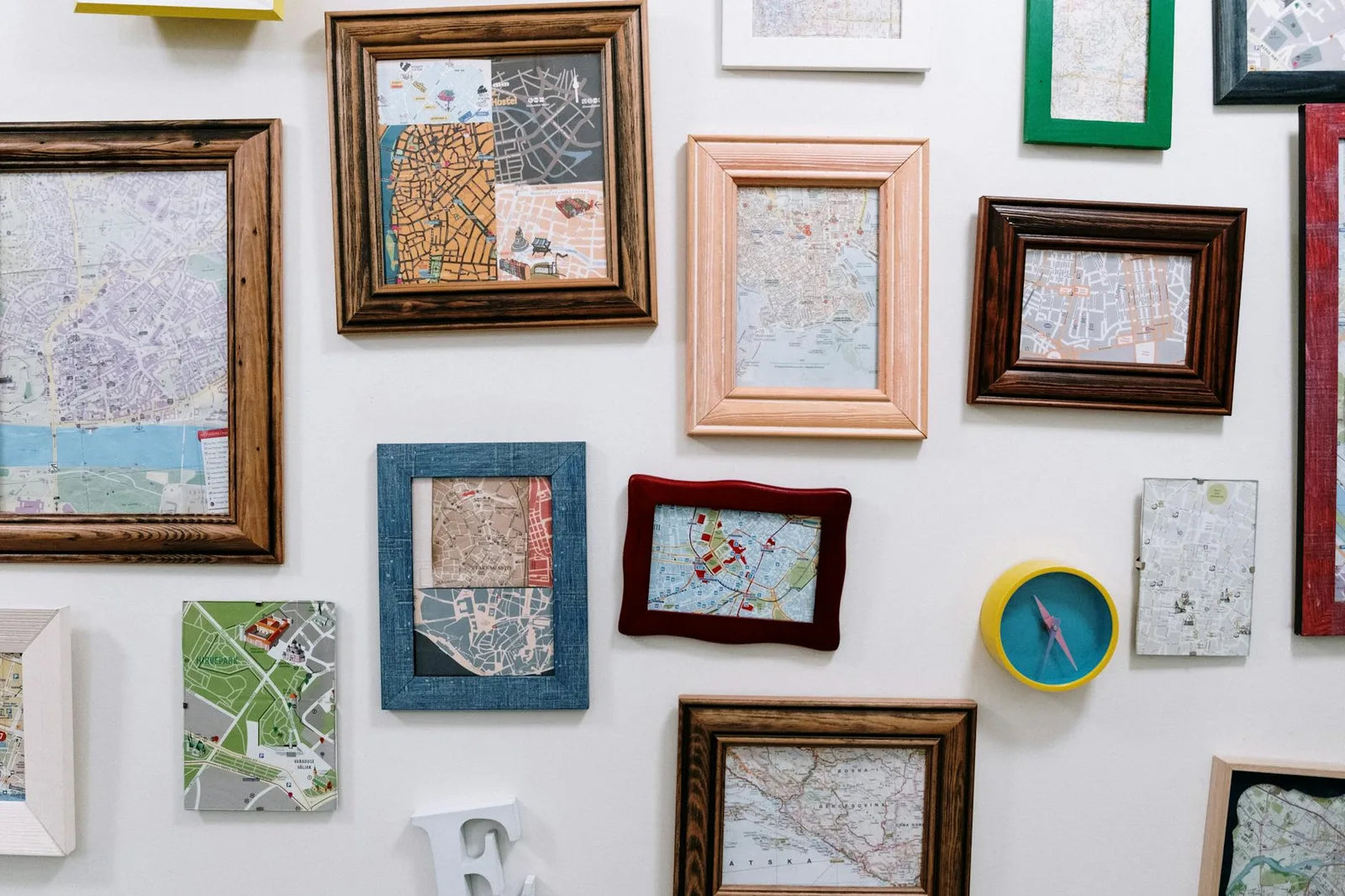
These three woods cover roughly every domestic use. Gilded and brass have their place in more specific contexts (assumed Art Deco interiors, bistro kitchens), but they do not hold in most contemporary apartments. Wood, on the other hand, crosses every style, from Scandinavian to Haussmannian, from japandi to mid-century.
Natural oak: warmth without folklore
Oak is the warmest of the three frames. It warms the cold colors of a poster and softly marks the edges without dramatizing them. It works very well with botanical illustrations, landscapes, Japonisme, Art Deco works in beige and bronze tones, and cocktail watercolors.
It is the default frame in Scandinavian, japandi, or contemporary interiors with a light dominant. On a very white wall, it brings the touch of matter that keeps the whole from feeling cold. It ages well: at ten years it has picked up a faint amber patina that makes it more beautiful than the day it left the workshop. That is the argument nobody tells you in a shop but which matters in the long run.
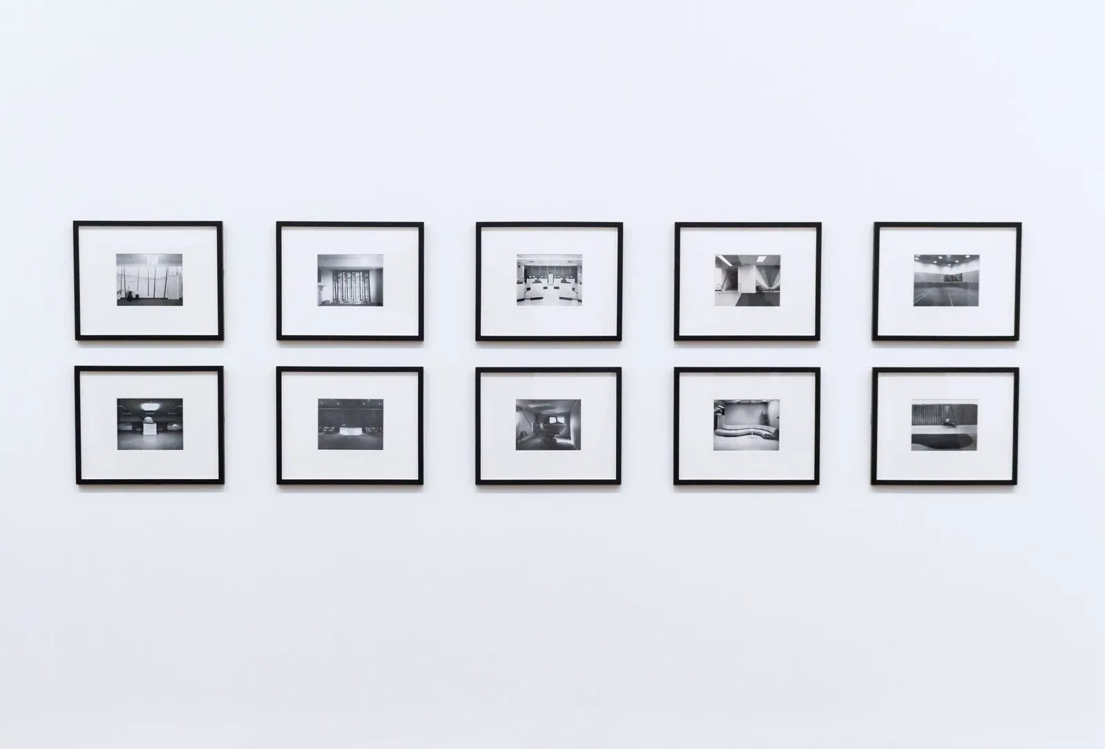
Matte black: the universal default
It is our default recommendation when you hesitate. Matte black works with almost everything. It makes very colorful works (Matisse, Yayoi Kusama, saturated Art Deco) stand out by absorbing peripheral light. It disciplines very loaded compositions. It is neutral, timeless, and never dates. On a gallery wall, it is also the frame that lets you mix the most varied works without looking incoherent.
Three cases where matte black is clearly superior to oak. Black-and-white photographic posters, where a light frame would create a border that distracts. Works with very light grounds (Matisse cut-outs, old botanical plates), where black acts as a definitive border forcing the eye into the image. And Kusama dot compositions, where matte black dialogues with the black motifs without competing.
If you do not know, take black. That is what works in 80% of cases, and that is what dates the least.
White: the frame that disappears
A white frame disappears into white walls. That is the point. It suits ultra-minimalist compositions, where you want only the work to be visible. It works well with black-and-white photography, works with a very large mat, and contemporary abstracts in a light palette. It works rather poorly with old works in very warm colors, and it has to be avoided in very bright rooms: white quickly takes on a yellowed tinge under natural light. Oak, conversely, gains over time.
The mat board, the detail that decides
Our frames all carry a beveled cream cardboard mat, 4 to 5 centimeters around the poster. It separates the work from the frame, gives it air, recalls the museum role of the frame. Without a mat, the frame merges with the poster, and the whole loses legibility. It also plays a practical role: it creates an air chamber between paper and glass that slows condensation in humid rooms, prevents the paper from sticking to the glass in hot weather, and protects the surface from direct contact with the Plexiglas.
Going frameless: clips and pins
Frameless, meaning a poster fixed to the wall with no frame, has taken a real place in japandi decor over the last ten years. Two light wooden clips hold the poster at the top, sometimes at the bottom as well. It makes sense for posters you plan to swap often (seasonal pieces, rotations in a child's room), for very spare spaces, or for exposed brick and raw concrete walls where the bare paper dialogues with the wall texture.
It does not in a kitchen or bathroom: bare paper yellows in a few months under steam. For art pieces meant to last, the frame remains the option that truly protects. Experience shows the frame ages better than the frameless in 80% of domestic cases.
Three questions to ask before choosing
- What is the dominant color of the wall the poster will hang on? On a very white wall, oak or black. On a dark wall, oak or white. On a colored wall (sage green, deep blue, ochre), oak or black.
- Is there already visible wood in the room? If so, oak in the frame creates consistency. If not, matte black is more discreet.
- Is the poster meant to stay ten years or to rotate? For the long run, frame with mat board. For rotation, frameless or frame without glass.
For more specific questions on sizing, weight capacity or hanging, the FAQ page covers the most frequent cases (plasterboard wall, stone wall, maximum load per wood, frame shipped assembled or in kit). The whole of our poster catalog is compatible with the three woods on offer, from 30 by 40 to 70 by 100. Frame choice happens directly on each product sheet, at the time of ordering.