A living room, late afternoon. On the wall behind the sofa, a single poster: overlapping blue planes, with no recognizable subject. The raking light slides across it, and the eye settles there without trying to understand. That is exactly what abstract art does in a room. It tells no story, it lays down a color and a shape, and lets the rest of the decor calm down around it.
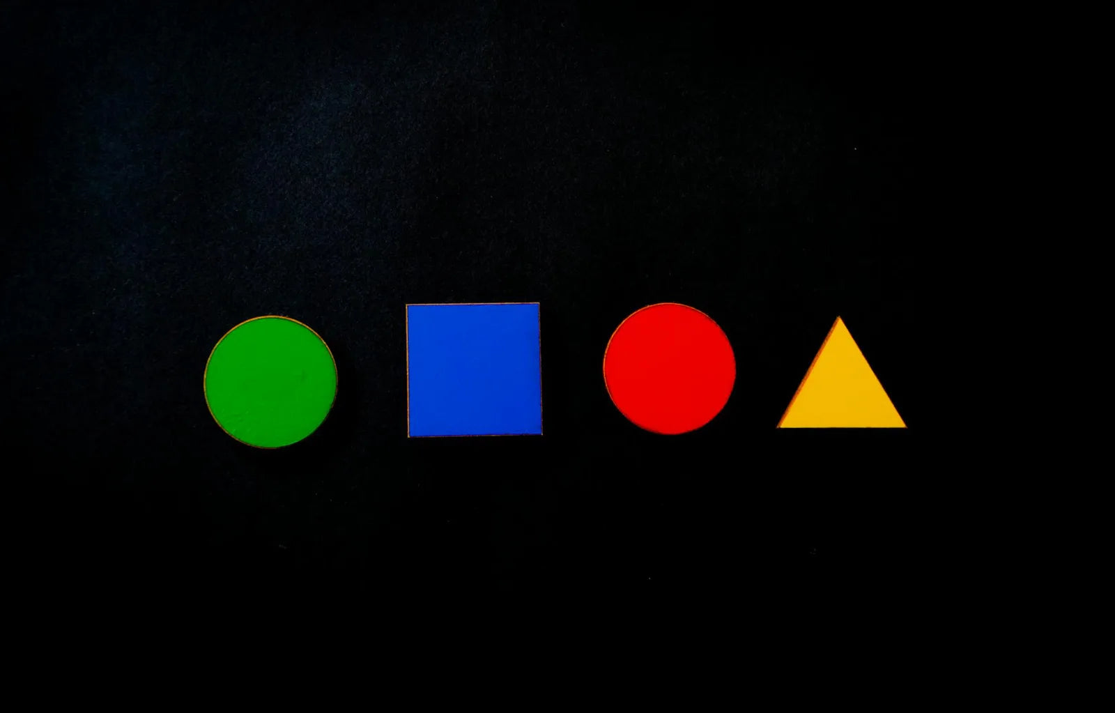
Decorative abstraction does not need to be explained to work. Since Kandinsky and Delaunay in the early twentieth century, the principle holds in one idea: color and form alone are enough to carry an emotion. For anyone decorating, that means a precious freedom. An abstract poster dictates no theme to the room, it brings a chromatic chord. What remains is giving it room to breathe.
One large piece or a pair
Two strategies almost always work, and they exclude each other. The first: a single large poster, 50 x 70 cm or bigger, set like a window on an otherwise bare wall. It becomes the room's center of gravity, and everything else, low furniture, lamps, textiles, arranges itself around it. The second: a pair of identical formats, hung side by side with an even gap of a few centimeters. The pair creates a rhythm, a visual breath, as long as the two pieces share a palette or a common tension. What to avoid is mixing: one large piece flanked by small mismatched posters blurs the message.
Balancing a busy abstract
- Calm wall: keep a dense, color-rich abstract for a plain, light wall, with nothing around it.
- Distance: step back three meters before fixing the hanging, an abstract reads from afar.
- One color picked up: pull a single tone from the poster, a cushion, a vase, and stop there.
- No competition: never place two strong pieces facing each other in the same room.
The right frame
The frame changes everything on an abstract poster. A thin black frame tightens the composition and sharpens the contrast of colors, ideal for a graphic, clear-cut motif. A light wood frame softens the whole and lets pale planes breathe, perfect for a gentle or minimalist abstraction. The golden rule: leave a white margin, a mat, around the image. That margin gives the color air and keeps the poster from looking smothered against the glass. On a very light wall, a thin frame is enough; on a dark wall, a light frame makes the piece stand out.
An abstract poster does not ask to be understood. It asks for space, a margin, and a wall that falls silent to let it speak.
At Montmartre Poster, the abstract collections gather minimalist planes, colored geometries and compositions inspired by Orphism and Cubism, printed on 275 gsm art paper. Enough to lay a chord of color on a wall, and let the room organize itself around it.